
The Mobile-First Index, and Preparing for Google's Speed Update
Google this week announced that starting in July 2018, page speed will become a ranking factor for mobile searches. The search engine’s self-named ‘Speed Update’ will only affect sites with the slowest pages, so if increasing your site’s mobile performance has been on your to do list for a while, now’s the time to do it.
We’ve known since the start of last year that the way Google crawled, indexed and ranked websites would soon move to a mobile-first approach, and have been waiting for confirmation that mobile page speed would be counted as a ranking factor.
The long awaited mobile-first index is finally here. And that means exactly how it sounds – the search engine would crawl the mobile version of your website first, before the desktop version when compiling search results.
It’s worth noting that mobile-first doesn’t mean mobile only. If your site doesn’t have a mobile-friendly version, the desktop site will still be indexed, but it could mean your site is ranked lower than a competitor who does have all their mobile ducks in a row.
Google is currently evaluating sites on their readiness to move to mobile-first indexing, and switching them when ready. Rollout is currently in process for a handful of sites, and you’ll know if yours has transitioned if you are monitoring how Google crawls your website, as you should expect to see an increase in visits from Googlebot Smartphone in your server logs like we have seen for a Fresh Egg client below.
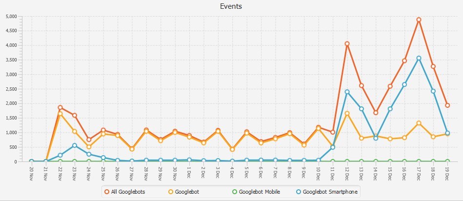
An increase in Googlebot Smartphone crawling on a Fresh Egg client site means their
site has already moved to mobile-first index
Mobile took over desktop web traffic for the first time in 2016, so it shouldn’t come as a surprise that Google wants its search index to represent its primary user group and this shifting change in behaviour. What does come as a surprise though, is just how many websites are not fully mobile optimised – especially with Google’s announcement today that finally, like with desktop, page load time would be a ranking factor for mobile-first.
The need for speed
Load times and perceived load times have huge impact on site engagement and abandonment.
It’s crucial for good UX, important for optimising the customer journey, and Google have now said that the speed of your site on mobile will directly impact your search ranking too.
Recent research from Google HQ has found that the average time for landing pages to load on mobile is a whopping 22 seconds. That’s quite a jump from the three seconds a user is prepared to wait before abandoning your site in search of a faster competitor.
According to the search engine, the chance of a bounce increases to 32 percent when the page load time moves from one second to three. That figure rises to a 90 percent when the page load takes five seconds, and it’s not even worth talking about the 106% probability of a bounce if your site takes six seconds or more to load on mobile.
So it’s now more important than ever for your mobile site to be fast, functional and fully optimised for great UX.
There are lots of elements that affect page speed, and Google posted on its blog at the end of last year how to get your site ready for mobile-first indexing, but we’ve got a few more to add to that list.
Here are 5 things you should definitely do to get ready for mobile-first.
1. You should make your images mobile friendly
One of the main culprits for the bloat and slow loading of many mobile sites is images. A recent study by httpArchive, which tests the top one million sites several times each month, found that the size of images sent to mobile devices has increased from 352KB in 2011 to 1.49MB in 2016.
Even if your site is responsive it's worth looking at whether your images are compressed and scaled specifically for mobile downloads.
Forcing mobile-users to download desktop images will make the site slower to load and will unnecessarily use excess bandwidth of each user.
Flickr is a prime example of a site showing mobile users unnecessarily large images. Take for example this page – a mobile user accessing this page is being forced to download a 533KB image with a resolution of 1600 x 930, but that’s displayed on an iPhone X at just 375 x 222:

Flickr needs to create a separate, smaller image for its mobile users so that the mobile browser downloads that instead.
For example, if Flickr created a separate smaller image, with the dimensions 480 x 279, this 533KB file would shrink in size to just 126KB. That is a 76 percent saving in file size that would result in the page loading much faster for mobile users.
2. You should definitely move your site to HTTPS
I’ve written before about why you should migrate your site to HTTPS, so if you’re still deliberating, here are a few reasons why it’s crucial not just for overall security and user trust, but also specifically beneficial to Google’s mobile first index.
Whenever page speed and HTTPS is talked about in the same sentence, there’ll always be someone in the room who’ll mention HTTPS is slower than HTTP.
Whilst technically, this is true, the speed benefits from migrating to HTTPS greatly outweigh the prospect of sticking with HTTP and here’s two reasons why:
It opens the door to HTTP/2
If ever the HTTP protocol that’s served us well for the best part of two decades was to get a makeover, it would look like HTTP/2.
It’s an upgrade built for improved speed and performance, and designed to answer the needs of the modern web, meeting growing user expectations.
HTTP/2 started life as an experiment at Google called SPDY (the clue’s in the name), and it grew into the next official HTTP protocol.
As of 2017 it’s supported by 76 percent of global web browser usage and is quickly becoming the standard protocol for web traffic, but it only works over a secure connection (i.e. HTTPS).
The great thing about HTTP/2 for the mobile index is it allows for multiplexing, which means the browser can request multiple assets to be downloaded simultaneously from a page, making for a much faster and streamlined experience.
This is different to HTTP/1.1, where the browser can only request up to six TCP connections per domain.
Still with me? Let’s break it down.
If a web page has 12 images on it, or an image is broken down into multiple parts, the browser can only download six of those at a time.
This is illustrated in the below video where the same image has been broken into 100 smaller images, with the HTTP/2 files loading much faster than the HTTP/1.1 files:
Bearing in mind the three-second time limit your site has to load before users abandon it in search of another, I think the value of HTTP/2 is pretty clear.
To see more demo of the speed improvements check-out both this and this.
You can use HSTS preloading
If your name’s not on the list, you’re not coming in. Well, you will still get in, but you’ll have to knock on a few doors and go round the houses first.
HSTS preloading is a security policy to stop man-in-the-middle attacks by forcing browsers to only ever use the HTTPS version of the site. This removes the ability for a browser to use HTTP even if the user specifically clicks on an HTTP link.
Chrome, Firefox, Opera, and Edge all use a global HSTS preloading list, and if your site is on that list, whenever a person tries to access the HTTP version of your site, the browser will automatically switch the request to HTTPS without any communication with the server. The user doesn’t have to go through extra redirects and in turn ends up having faster experience.

3. You should defer JavaScript
No one likes waiting. So don’t make your users wait too long for unnecessary code to load on your site before showing them content.
The time it takes for a page to start loading content (known as First Content Paint) is a metric that Google reports on in its PageSpeed Insights tool, and is a figure that should be a focus for webmasters. By rearranging the order in which a page’s assets load, and prioritising above-the-fold content, this figure can be kept low, even if the rest of the page requires a lot of additional assets to work. Not only will this improve the perceived load time of a page, it will help decrease the bounce rate and gives user a better experience of the site
Remember that crucial one to three-second window before a 90% bounce?
If your web page is loading every single line of code along with all page content such as images, text, buttons and other structural features, it could be slowing your site right down.
But you can get around this by deferring JavaScript.
Basically (I know I am getting techy now, but it is my job) this is reconfiguring the code so that above-the-fold page content is loaded first, which makes a happy user and happy Google). Then, the loading of all other JavaScript only begins once the page content has loaded. So to the user this makes the site look nice and speedy – they don’t need to know (or care) about the rest of the code loading in the background as they browse the site.
How to: To do this you need to get your developers to split the code into two parts – the JavaScript that the page needs in order to load above the fold content should be written into the page. And the rest of the code can be put into an external file to load afterwards.
You can either do that by pushing the external file to the bottom of the HTML or use the HTML defer attribute to delay loading.
4. You should defer videos
There’s a fine balance to be made with providing a fast, light mobile experience, but also still using entertaining content like video.
As a site owner, you want to keep users engaged, but the three-second bounce window doesn’t always leave much room for the loading of heavy video content.
So this is where deferring videos comes in. Much like deferring JavaScript, the loading of a video, or at least the loading of the video player, can be deferred until it is needed.
We recently implemented a fix on a client site to improve load times by only rendering an image of the video from the YouTube API when the page loads. So when the user clicks the play button, the video is inserted into the page and starts playing automatically. This means it only loads all the assets needed to play the video if the user actively clicks to watch it.
You wouldn’t open a bottle of wine if no one was drinking. But you might keep the cork screw handy and visible just in case.
How to: You can find out more about deferring videos here and here.
5. You should activate AMP on your pages
We have been banging this drum here at Fresh Egg for quite some time now. Fast, beautiful, high performing across all devices and distribution platforms. That’s the promise of Google’s Accelerated Mobile Pages project (AMP).
Designed to give the web the speed boost it craves, AMP pages create a faster version of your existing pages for distribution around the web. Think Google, Twitter, LinkedIn, Medium, Pinterest and more.
Built with AMP HTML, AMP JavaScript and AMP cache, it promises higher performance and engagement, loading nearly instantly to give users a smoother, friction-free mobile experience.
It can be a turn-key solution to having a high performing site with good UX, using the aforementioned HTTP/2 (hurrah!) and doesn’t always require a large budget or development team (i.e. with WordPress.
AMP is not yet a ranking factor so has no impact on SEO, but giving your customers a fast, functional and frictionless mobile experience is crucial for customer satisfaction, retention and conversion.
How to: Find out more about the AMP project here.
It’s pretty clear that in a mobile first world, speed is really important. If your site takes too long to load, for whatever reason, it really doesn’t matter how good your content is. Don’t give users a reason to jump ship and get your site ready for mobile first now.
Need help understanding and optimising customer experience on your site? Let’s have a chat.