
Get to Know The New Google AdWords Reporting Tool
Towards the end of 2015 Google rolled out an all new reporting interface for AdWords. The previous reporting interface was functional but data heavy, plotted in a myriad of Excel spreadsheets, that often required a pivot chart to understand.
Instead of that fuss, the new interface uses graph and table functions to present data visually, making it easier to understand and interpret.
Compare metrics and functions
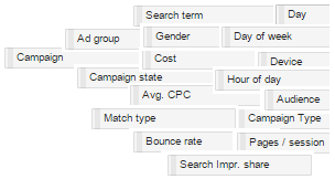
Additionally, dozens of metrics and functions can be crossed and compared with just a few clicks of the mouse, including:
Different chart options to uncover data trends
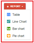
The interface is accessed through the ‘Reporting’ tab at the top of the AdWords Screen, then through the red ‘Report’ button. There are four charting options – let’s take a look at a line chart:
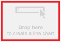
You’ll see that the interface is a simple drag and drop area:
Here we’re looking at impressions by campaign:
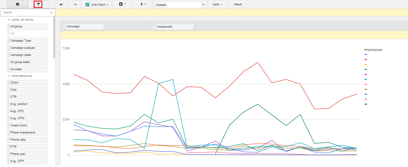
Any of those attributes on the left can be dragged into the graph to change the data view, although be aware that each chart option has limits to the number of attributes that can be overlaid with one another.
Hovering over any point on the graph uncovers the name and the numerical data, and you also get a handy key along with numerical figures to the right of the graph, showing your selected metric(s).
There are also hundreds of filter options which can be accessed via the filter icon on the top left of the screen. Want to look at just a select few campaigns? You can! Want to view only live campaigns? You can! Want to find out how mobile performs on the Search partner network on just those campaigns with, say, ‘Generics’ in the title – you can!
There are hundreds of possible combinations – the Fresh Egg team have found the following combinations particularly insightful, given how time consuming it would be to run this data using the old interface:
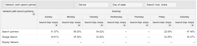
- Network performance, per device, per day of the week
- Campaign subtype, by network (for example, Shopping Ads on the Search Partner Network)
- Conversion categories, broken down by device
- Match type vs almost any other metric
Analyse multiple segments at once
Where the interface really excels is the insights it offers when analysing multiple segments, overlaid with one another, such as day of week and device:
If you’re using the same keyword with different match types across different ad groups or even campaigns, a table view lets you quickly compare performance.
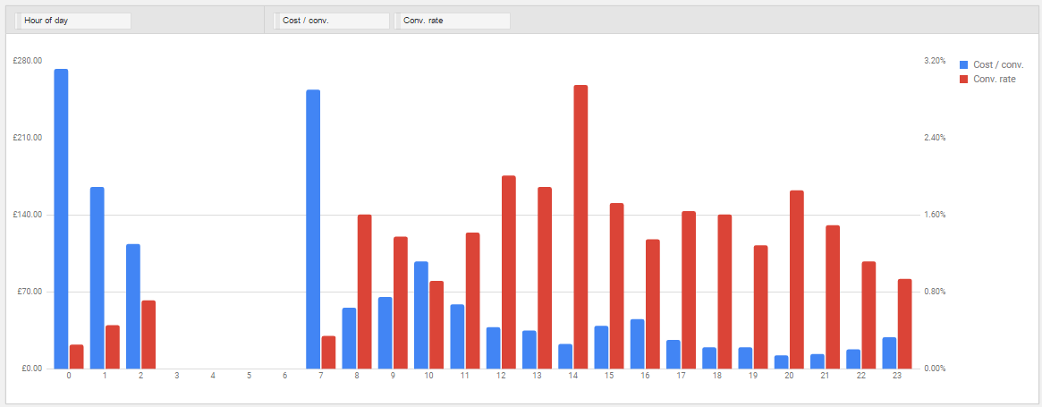
The bar chart options are very handy in visualising data that was previously available only in table form, for example day/hour parting:
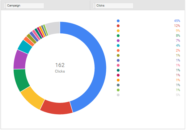
And of course, there are pie charts:
As you would expect, all of the report options are available to export, variously to Excel or .pdf formats depending on the report type. They can also be automated to be sent out at regular intervals, although these must be chosen from a pre-defined list – for example, there isn’t currently an option, to select to receive the report on a particular date each month.
Some missing features
There are still some options missing that you might expect:
- YouTube and Gmail metrics that are available through AdWords filters
- Some metrics cannot be combined with certain metric and filtering options
- Custom labels are not available in the reporting interface
- It’s not possible to segment by percentage changes as you can in AdWords – for example, filtering by campaigns with a metric percentage change above a certain level
Google regularly update their AdWords products, so it’s entirely possible that these and other functions will be added.
What’s your favourite feature of the new interface? Which combinations of metrics have you found useful? Let us know your thoughts about the new reporting interface in the comments box below.
If you’d like more information about the new reporting interface, or anything related to Biddable media in general, the biddable team would love to hear from you.