
The Impact of Colour in Your Designs
Design | 8 MIN READ
Exploring the psychological effects of colour choices in UX design and how colour can influence user behaviour and perception is essential for design projects. Read on and learn about the importance of the impact of colour in your designs.
The importance of colour
As per the following statement, you can see that colour can have an incredibly powerful impact on your business – from your brand perception to the products you sell or services you offer.
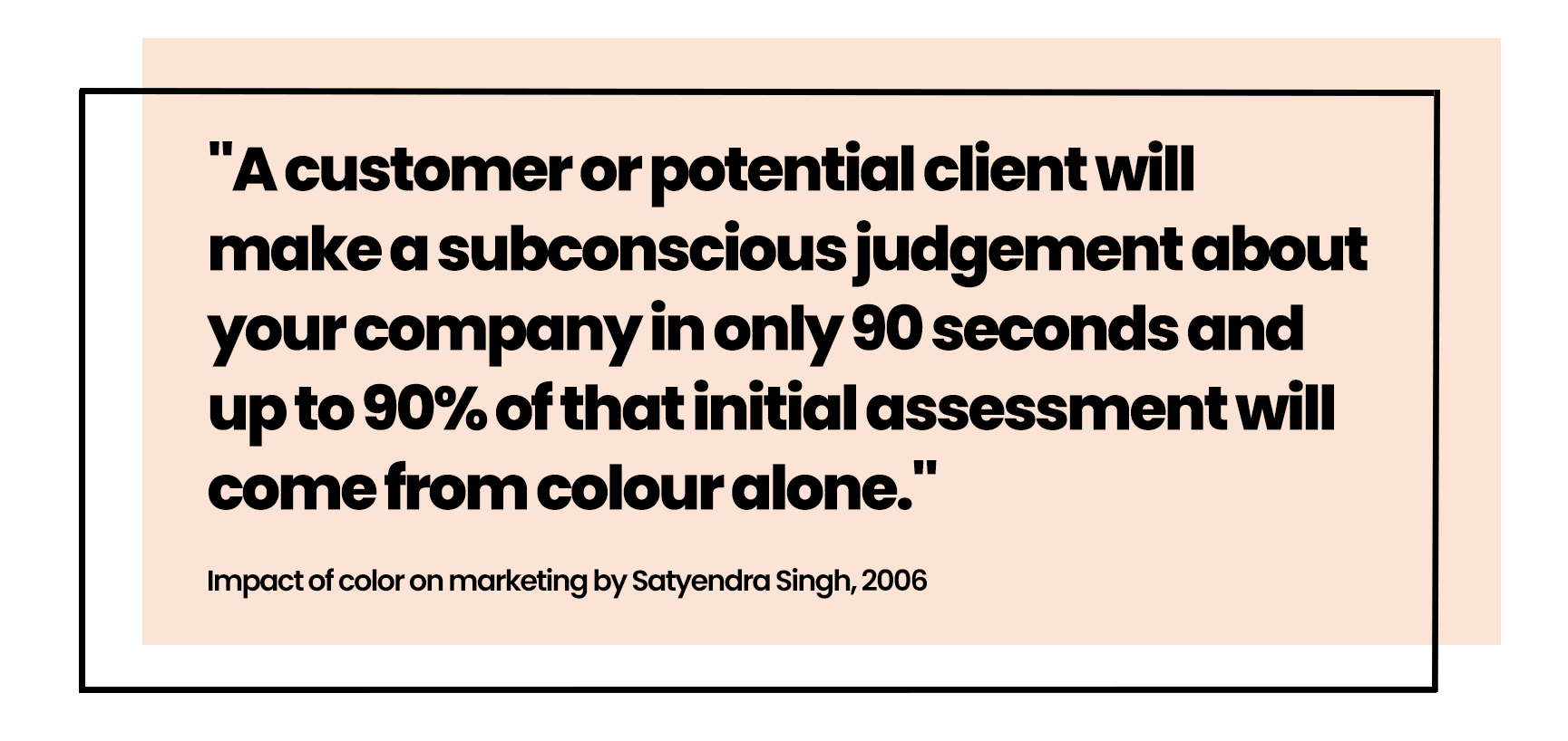
Have you ever explored what your brand colours say about your company? I want to tell you that there is a magical colour palette that will mean your brand will appeal to a particular audience or a CTA colour that will guarantee more conversions. In reality, there is no magic formula. To fully understand what is right, you need to work within the realms of your target audience.
Sarah Simpson, Senior Experience Designer

What do colour studies tell us?
The psychological perception of colour is subjective. Many studies have revealed differing results for favourite and least favourite colours between men and women and word associations and perceived meanings behind different colours. Many factors could skew these results, including the geographical location of survey participants, which can highlight different cultural conditionings or influences that change over time with art, fashion, and commerce trends.
Men are blue and women are red!
That may sound like a famous book title from the 90's (Men are from Mars, and Women are from Venus), but it is precisely that. A very early study by Jastrow in 1897 showed that men preferred blue to red and women red to blue.
The difference between the average male and female chooser is striking. The women's favourite colour is red, the men's is overwhelmingly blue: "of every thirty masculine votes, ten were for blue and three for red; while of every thirty feminine votes four were for blue and five for red." Men confine their choice to relatively fewer colours and have a less marked tendency than women to choose the lighter and daintier shades.
More recent studies, such as the 2003 study by Joe Hallock show slight differences between preferences for blue or red between the genders, but women most certainly did not prefer red over blue.
What about the caveats?
Looking at Joe Hallock's study regarding colour preferences between genders, we should consider that the study had participants from across 22 countries, but mainly from the USA (79.3%) with a mean age of 30.
Results from colour studies
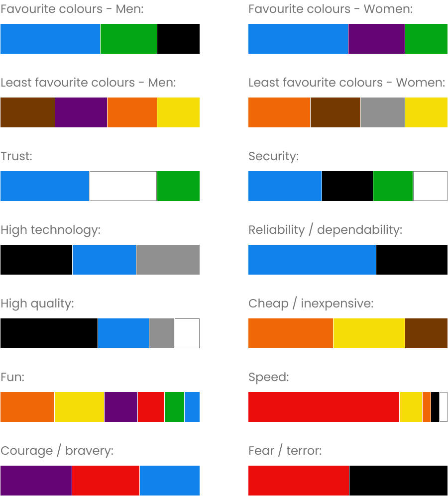
Colours and word association
Other colour studies have established a set of further possible word associations:
There's colour, and then there's tone.
If we're going to step into the realms of tone, a study by DJ Radeloff in 1990 stated that men and women had no apparent preference for darker or lighter colours. Still, women preferred softer colours, and men preferred brighter colours.
What can you learn from studies like these?
Some general takeaways could help your organisation make some initial colour decisions, but only if the demographics in these surveys cover your target audience. Ultimately, you should aim to discover your audience's preferences and test any significant changes to your colour palette with them.
Can I be so bold in saying that you could also break conventions when it comes to your brand colours too!
Sarah Simpson, Senior Experience Designer
Breaking colour conventions
There are many examples where big brands have stepped away from stereotypical colours for their industry sector.
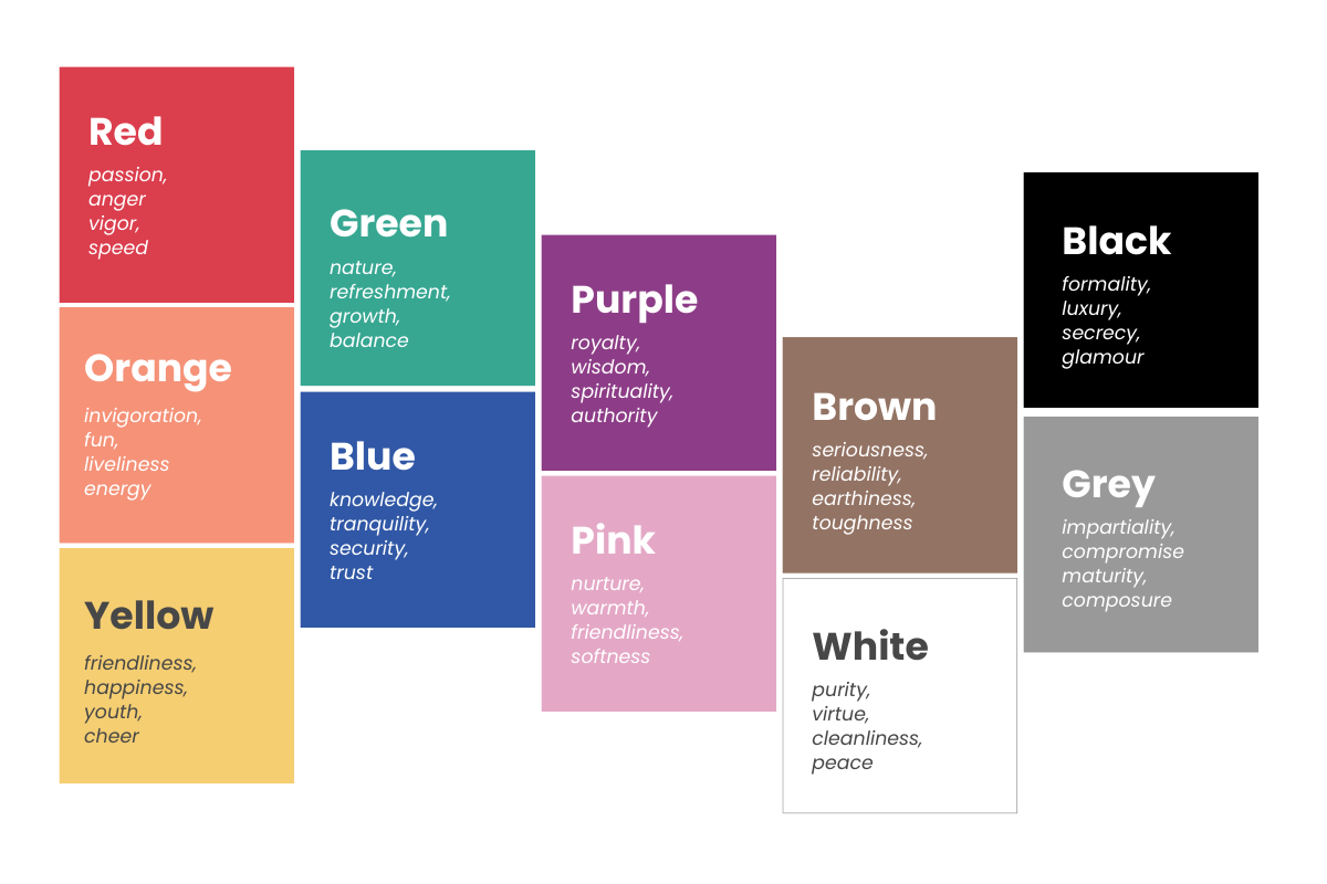
Let's take the health industry as an example. Typical brand colours in this sector are often associated with blue, green or white, which evoke trust, knowledge, security and a feeling of cleanliness and calm.
However, since 2000, pharmaceutical giant GSK took the bold move to use a gradient orange/yellow as their primary brand colour. If you were to consider Joe Hallock's 2003 colour study, orange often comes up as people's least favourite colour and would be associated with words like cheap, inexpensive and fun. These are terms I'm sure most people would not associate with GSK.

A quick search around some of the top health research, charity and support organisations in the UK, including Cancer Research UK, Breast Cancer UK and Young Minds, demonstrates that you can be linked to the health sector and be bold with your colour choice. Each organisation uses bright orange, pink, purple and yellow in their brand palettes.
Getting inspired by colour
Search for a colour palette generator; there are lots of options for you to explore.
If you like to follow the latest colour trends, check out the suggested palettes on Coolors.co. You can even add Coolors palettes into your design workflow with plugins for Figma and Adobe software.
Let's get more technical now and delve into AI. Colormind.io will generate colour palettes based on deep learning from colour in photographs, art and movies. If you're anything like me, get inspired by colour schemes in interior design, art, and nature. In that case, you can upload an image for Colormind to analyse and generate a colour palette inspired by your favourite image.
Once you have established your colour palette, explore its tints and shades too. Playing tonally with your brand colours can open up many more colour possibilities for your UI designs. Another tool I love is Make tints and shades – simply add your brand colours and watch it create perfect tints and shades that you can copy and paste into your design system.
When your brand palette is allowed to change
Now you have your initial brand colours, tints and shades - have you tested them to see if they are accessible? For example, is the contrast enough to be readable when paired with your typography colours? Or, have you checked what your colours look like to someone who is colour-blind?
Did you know:
- Over two million people in the UK are living with sight loss.
- 1 in 5 people will live with sight loss in their lifetime.
- Three million people in the UK are colour-blind.
We are very mindful of creating accessible experiences at Fresh Egg. We will always evaluate a client's existing brand palette to see if it complies with at least WCAG 2.1 AA colour contrast standards and make alternative colour suggestions if necessary.
Sometimes, there are legitimate reasons to step away from rigid brand guidelines.
A real example of improving accessibility
We recently analysed the brand palette for one of our clients, Agria Pet Insurance. We quickly established that the green used for their CTA buttons failed all colour contrast checks. We set about establishing a set of brand colours with them that would pass AA colour contrast standards. With a small change, we instantly refreshed their brand green and made an essential component of their website accessibility compliant.
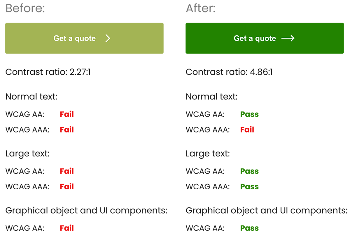
Generated with the WebAIM colour contrast checker
Free tools are available
There are free tools available to help you evaluate your colour choices on your website or as part of your design process:
Wave by WebAIM is a great web browser extension that offers a reasonably extensive accessibility review of each page, offering an easy-to-follow report of where you could be making improvements, such as colour contrast.
WebAIM colour contract checker and Colourcontrast.cc are just two of many colour contrast checkers available for free online. If you are a designer, Figma offers colour contrast plugins (such as Contrast) that you can use to check the contrast of your background and foreground colours while designing.
Colour blindness simulator enables you to upload an image and check how this will look with different types of colour blindness. You can judge if users can distinguish between your brand colours.
Light and dark mode
Do you remember when websites offered a toggle for light and dark mode? It's a slightly dated concept now, with many browser and device accessibility modes that let users control colour and contrast settings to suit their needs.
Have you considered testing your website in different colour and contrast accessibility modes on different devices? How are your UI colours holding up?
RNIB has maintained a light/dark/yellow colour switcher on its website to make its content readable for an audience with very different visual impairments. The organisation could have solely relied on users controlling their accessibility settings to achieve a similar effect – but from reading an article written by the lead front-end developer on the website build, their research suggested that not all users are proficient at using web accessibility tools.
If there is potential for your target audience to be visually impaired, a very cost-effective way of adding embedded accessibility tools into your website is to use a third-party widget. A few to explore include Recite Me, EqualWeb and accessiBe.
Should you be following colour studies to the letter?
I wouldn't recommend it – would a 30-year-old woman in Europe and a 30-year-old woman in Asia perceive the colour red in the same way? You can use these colour studies as a starting point in your research, but essentially, you must ask whether they cover your target audience. Please do your research with your target audience and ask them what they want to see. Develop your colour palette, test it with that audience, and be prepared to iterate.
Should you follow suit if other organisations in your sector follow a particular colour convention?
Not necessarily – find out if an alternative palette is appealing to your target audience. Sometimes, little changes in colour and breaking out of a mould will make you stand out.
Should you rely solely on technology to make your website more colour and contrast accessible?
Absolutely not! Ensure you embed your testing into your web design and development process. Test your colour choices and website with a broad audience to include visually impaired research participants. Keep checking to make sure your colours are at least AA contrast compliant. If budget allows, explore the possibility of embedding accessibility tools into your website. And despite saying not to rely on technology, keep checking your website using the latest available accessibility tools because some of your website users will want to use them.
Colour checklist
1. Conduct your own Colour Research
- What are your business values? Are there any colours that come to mind that could represent these?
- Research what your competitors are doing regarding colour – are they following a typical convention, or are they breaking the mould?
- Interview your target audience – get to know them: what are their favourite colours, and what do they mean to them?
2. Get Inspired
- Try using a colour palette generator – it may create a combination of complementary colours you may never have thought of.
- Take influence from a product or image that best represents your brand – you could use this as a starting point to generate a colour palette.
- Collate a collection of colours used by your competitors or companies who also target your audience demographics – ask your team to choose which combinations of colours they think best suit your target audience.
3. Test and Iterate
- Test your new colour palettes with your target audience – are your colour combinations working and creating the right impression for your business? Is there a good combination of brand colours that will make key UI components, such as buttons, stand out from other elements on the page?
- Consider running tests on your live website to try different colour combinations and see if they make a substantial difference in interactions with crucial UI components.
- Be prepared to iterate on your colours – do not settle with something that will "just make do". Remember that your colour palette can help to shape a successful brand in the future. Regularly changing your brand colours will mean that users will have to go through the process of brand recognition repeatedly.
Which brings me to my colour conclusion.
Your colour choices could make or break your brand; you must make the right decisions. My biggest takeaway is not to be presumptuous and conduct your colour research before heading down the wrong rabbit hole!
Do reach and contact us if we can help you with colour selection.