CRO Lessons from the Fresh Egg Test Archive
Conversion services | 3 MIN READ
There is no guarantee that a content or design change proven to increase conversions for one website will produce the same impact for another. Even so, pouring over the data from an archive of A/B tests and analysing the results uncovers trends and patterns that can’t be found anywhere else.
We use our Test Archive to generate optimisation ideas for new projects. We also use trends from the archive to assess the potential impact of test hypotheses. Occasionally, though, it’s interesting simply to reflect on what previous tests can tell us about the hidden opportunities for optimising websites.
What is the Fresh Egg Test Archive?
"We record the results of every experiment we produce, describing what we changed and how it affected our target metric. Each test is then categorised by industry, location, and “Dimension”, allowing us to find the most productive themes and areas."
Stephen Courtney, Senior CRO & UX Strategist
Lessons from the archive
Even a brief review of our test archive reveals clear lessons for anyone managing a CRO project. This post outlines six pro tips about where you should look for uplift when organising your experiment roadmap.
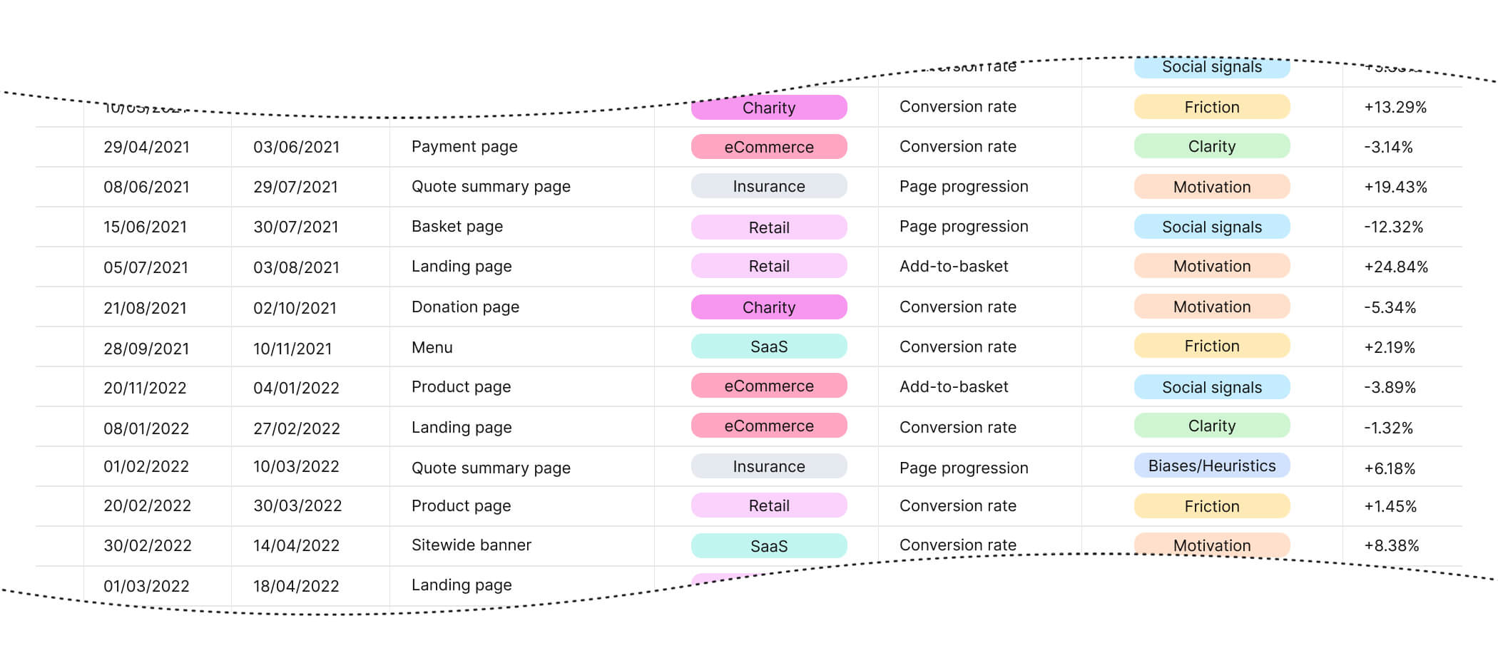
Each test in our backlog is categorised according to industry, allowing us to compare the size and frequency of our successes across different verticals. For clients in the charity sector, our experiments have produced statistically significant wins 40% of the time. Similarly, our win rate for financial services and insurance clients is an impressive 37%.
The Test Archive also gives us data about which "Dimensions" (aspects of user experience that we target in our test treatments) produce the most consistent results. Focusing on Motivation gives a statistically significant uplift 35% of the time and is responsible for some of our most substantial individual results. By contrast, tests focusing on Clarity have a comparatively low success rate and tend not to produce significant effects.
Understanding these statistics helps us to prioritise our test concepts and identify weaknesses in our approach to optimisation. They also highlight our strengths in areas where we have invested time and effort into audience research. The scale and frequency of our success when targeting motivational aspects of the user experience for financial services websites reflects the depth of our research into topics such as the psychology of insurance.
Lesson 1. Fix the Funnel First
Some of the most impactful experiments we have conducted over the past five years have been as simple as unblocking areas of the funnel that present unnecessary obstacles. These tests are crucial because they remove barriers that might otherwise limit the impact of other experiments.
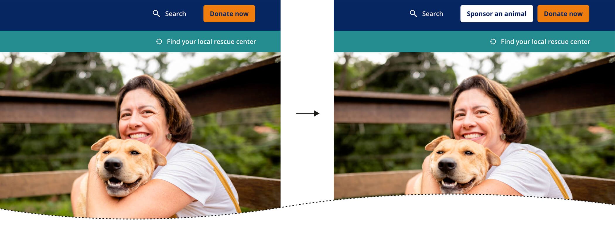
For example, we worked with a major national charity to grow and diversify the composition of donations by making the sponsorship journey more accessible. Simply adding a sitewide button for this alternative donation product made it easy for users to select their preferred option from any page, prompting a vast increase in both sponsorships and one-off donations.
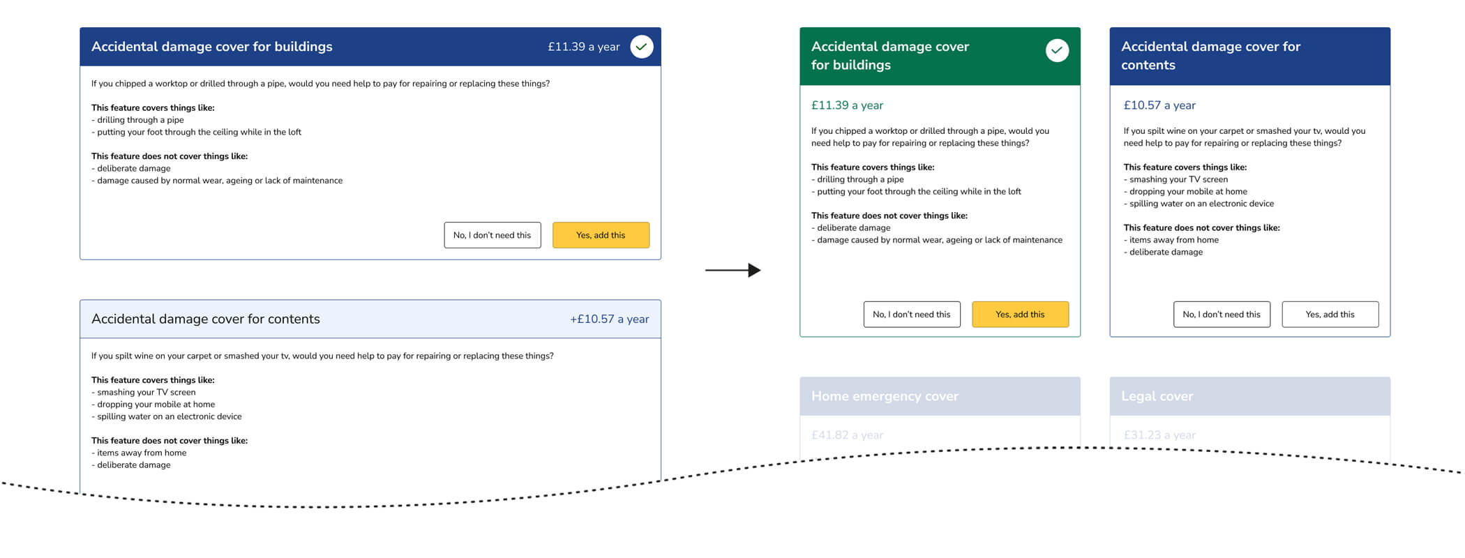
Similarly, we earned a considerable uplift for an insurance client by re-designing screener questions at the start of the purchase funnel. Confusing questions were misleading users about eligibility and cover types, but by reformatting those questions as simple statements to which users had to agree, we increased the completion rate by 5%. That simple adjustment required less than three hours of web development and saved our client thousands of pounds in incremental revenue.

£2.6m uplift for Ageas
Read how, through a single A/B experiment, we helped Ageas drive +£2.6m in annual incremental revenue by improving brand awareness and the value proposition.
Lesson 2. Motivation matters
Ensuring we present the user with a powerful reason to act at every point in the user journey has provided us with some of our most productive hypotheses across every industry vertical. A 2019 experiment we produced for a popular doughnut chain involved adding prices and persuasive calls to action throughout the product menu and purchase journey. The test increased the number of items added to a user's basket by 23.22% and the website's conversion rate by 17.39%.
We applied a similar treatment in an experiment for an agricultural equipment and gardening supplies retailer. We updated the way that products were displayed on category pages to highlight KSPs for a number of popular items. That simple change led to an increase in unique purchases of 19.8% and grew revenue per visitor by over 13%.
Lesson 3. Butterflies beat behemoths
Reviewing past A/B tests makes it very clear that the size of the experiment has little to do with the scale of the impact. Small, meaningful copy changes can dramatically affect user behaviour, whilst complex multi-page redesigns can often be irrelevant.
One experiment we produced in 2021, on the insistence of a prominent insurance client, involved reformatting a quote summary page to hide the policy options behind a progressive reveal. Because of the number of policy permutations involved and the difficulty of testing the experience locally, the build required over 30 hours of development time, only to produce a small decrease in conversion rate.
In contrast, we managed to increase the donor conversion rate for a large animal charity by 9.74% with one of our smallest-ever A/B tests. By changing the value of the prompts on the donation page, this test simultaneously increased donation frequency and size, increasing the average gift by over £2. Without adding or removing elements from the website, we earned hundreds of thousands of pounds in annual incremental revenue for a valuable cause.
Lesson 4: Micro-conversions build momentum
Many websites struggle to run conclusive experiments due to a lack of traffic or conversions. When the conversion rate for a website is too low to act as a testable metric, we will sometimes recommend building experiments around "micro-conversions". Using these intermediary steps to indicate the most effective design or content allows clients without lots of sales or transactions to optimise their key journeys step-by-step.
Insurance websites are well-suited to testing micro-conversions because the purchase journey is split into steps. An experiment we conducted in 2022 on a pet insurance landing page explored the effect of claims statistics on the proportion of visitors who entered the quote journey. The test demonstrated an increase in quote starts of 8.5%, and the subsequent analysis showed that this also translated to policy sales.
Lesson 5. Tangibility breeds trust
It's easy to be vague or to use abstract language when communicating with customers online. The desire to project a brand identity and a squeamishness about selling makes content teams shy away from the basic substance of an offer. However, our Test Archive is full of evidence that concreteness and tangibility are vital parts of a persuasive sales pitch.
In 2021, we updated a key landing page for an animal charity, adding real case studies about how donations had benefited rescued animals. The test described the impact that future donations might have in precise and concrete terms. These content updates resulted in over 10% more donations from visitors who landed on the target page.
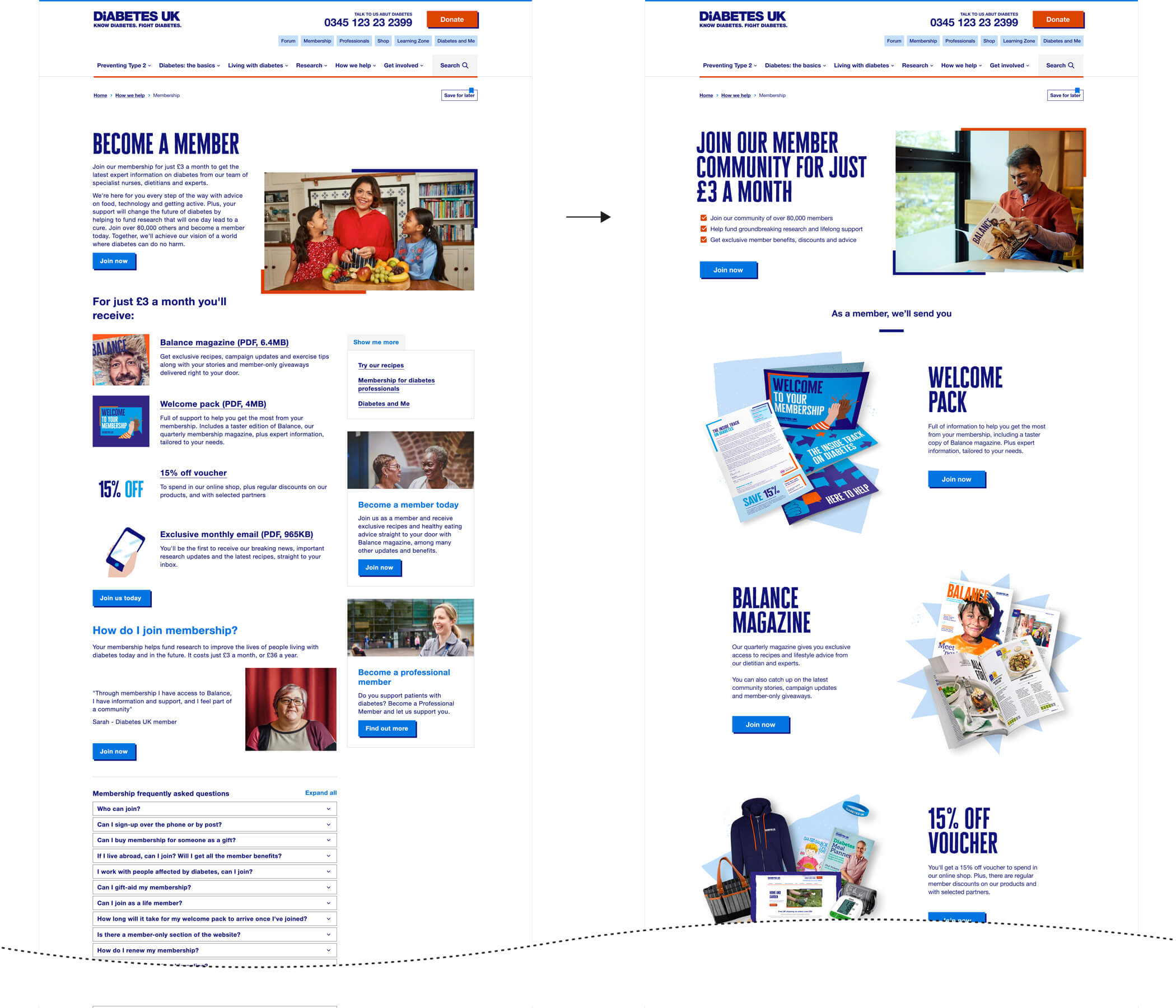
A similar principle lay behind an experiment we ran later in the same year, which aimed to encourage more member sign-ups for a diabetes charity. The test outlined the benefits of membership using clear images and more straightforward copy, highlighting the fact that new members would receive a free welcome pack and partner discounts. By presenting the benefits more clearly and tangibly, the proportion of visitors who signed up as members increased by 21%.
Lesson 6: Navigation matters
A surprising insight from the Test Archive is the fact that the structure of a navigation menu can seemingly influence commercial decisions and personal choices.
We managed to increase page views on donation and sponsorship pages for a client charity by introducing a new primary menu category that contained links to each product page in a drop-down box. However, not only did this test guide more users to relevant donor pages, but it also increased donations and sponsorships by a statistically significant amount.
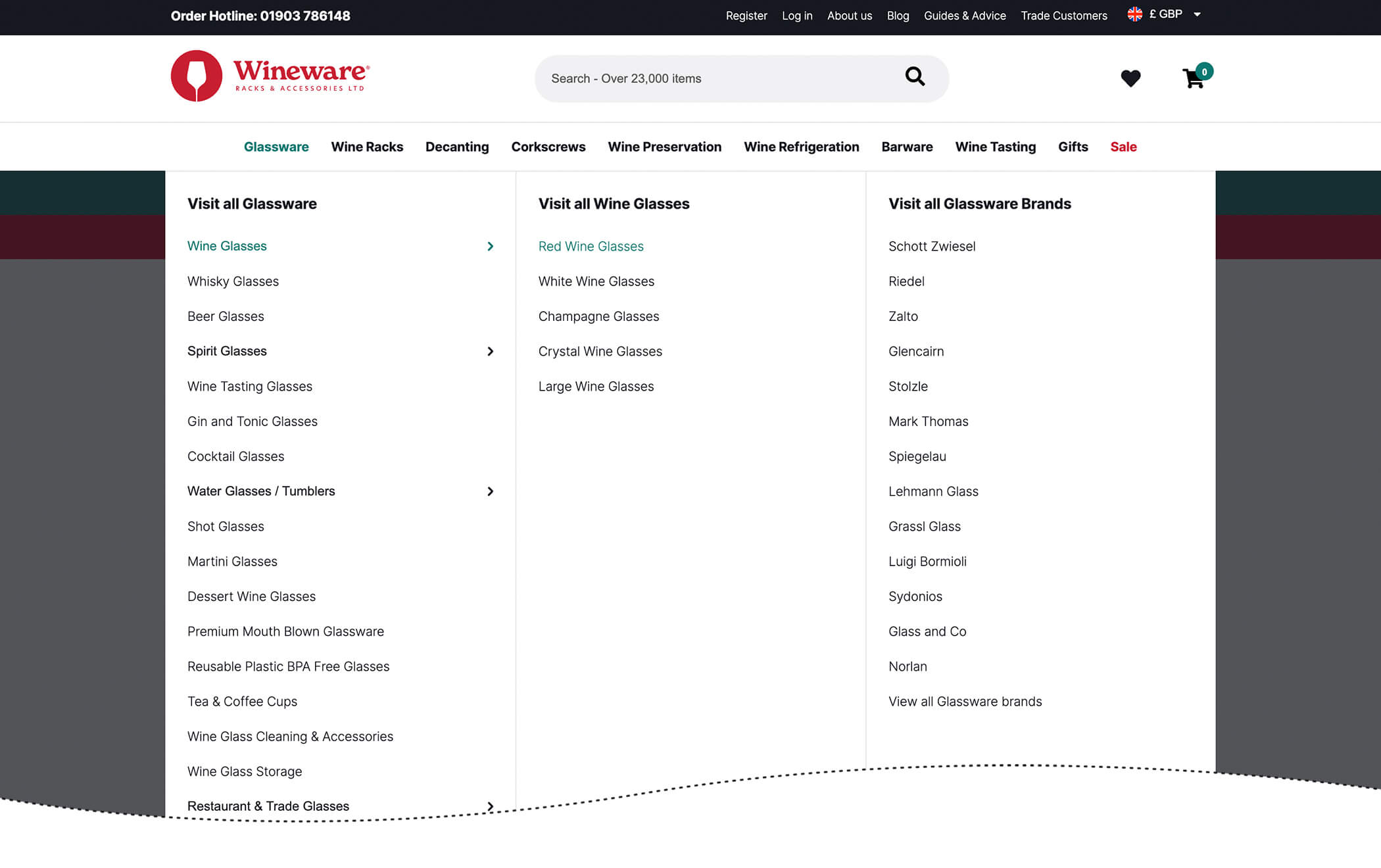
A more complex test we ran in 2020 involved creating a mega-menu for a specialist wine glasses and equipment retailer. The mega-menu made it easier for users to access more specific products and product categories with fewer clicks. The test produced a 5.9% increase in views for product pages and increased revenue per visitor by over 12%.
Let us help you enhance your website performance
Conclusion
As a CRO team, our large and expanding Test Archive is one of our most valuable resources. It helps us to qualify test ideas quickly, retain insights from previously successful projects, and focus on the things that will change user behaviour most noticeably.
More recently, we have begun to incorporate statistics and insights from our test archive into the heuristic reviews we provide for our clients. This means that clients of any size can benefit from the clear and highly specific insights generated by A/B tests.
