Using Google Data Studio for actionable insights
Use this Data Studio guide to help you with data storytelling. We share things you need to consider before building your dashboard, plus a few dashboard best practices and tips and tricks to make your life using Data Studio a bit easier.
 Alex Pereira
1.Video guide

2.Storytelling with Data Studio
What is Google Data Studio?
Data Studio (a rebrand of the formerly known Looker Studio) is a free data visualisation tool that allows marketers and analysts to turn data into easy-to-interpret, customisable and shareable dashboards and reports.
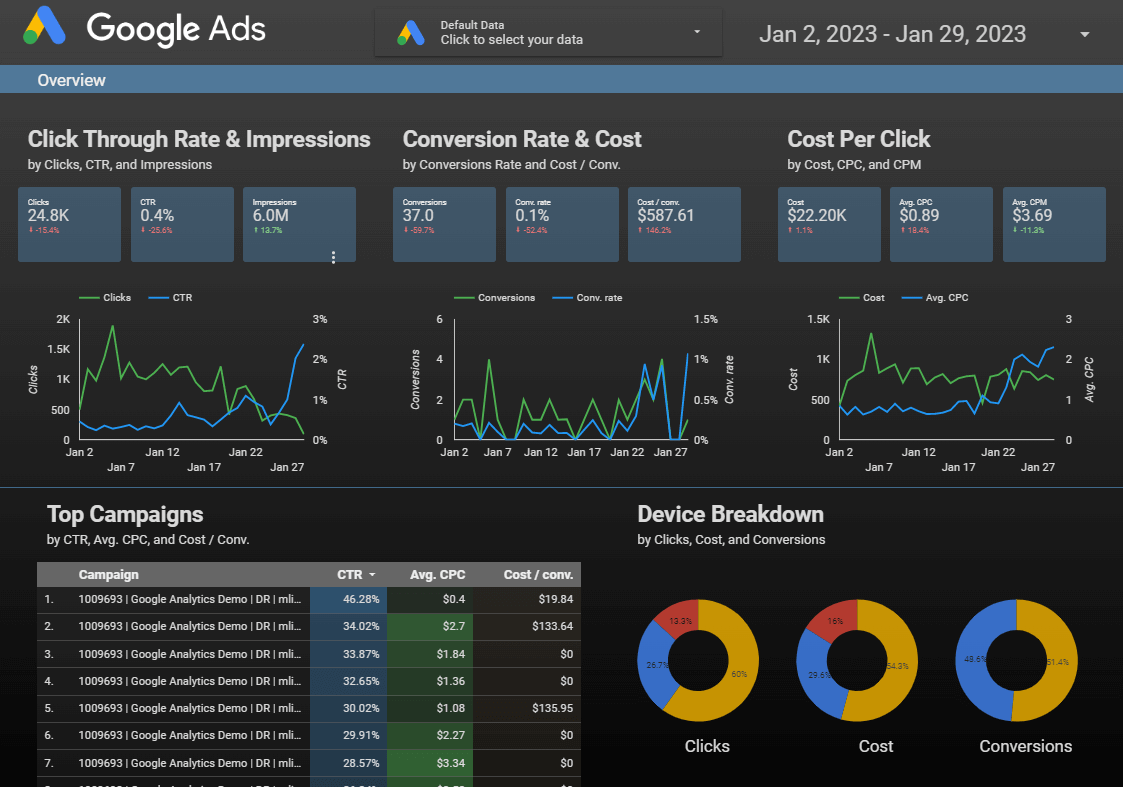
It facilitates building custom visualisations to tailor reports to your data. You can connect your dashboard to multiple datasets from various sources (such as GA4*, Google Ads, Google Search Console or Google Big Query) into one location and transform information into easy-to-understand reports.
Key facts:
Google's data visualisation tool
Facilitates creation of reports
You can connect to multiple data sets
It's free to use
* There are some caveats around the GA4 data set and token issues, so as best practice for GA4 data is to get BigQuery set up and use that as your data source.
What can Data Studio be used for?
Building reports and working with tables and charts is straightforward for marketing teams. A wide variety of chart types are available, including bar charts, pie charts and geographical maps.
Reports are made interactive through viewer filters, allowing users to adjust date ranges or segment data by specific dimensions, such as marketing channel or device type.
These capabilities allow users to explore datasets and dig deeper into the numbers with ease. The navigation bar can be tailored to feature separate pages covering different areas of the business, catering to the needs of various stakeholders. Displaying dimensions and metrics across different chart types is intuitive, making data simpler to interpret for any audience.
Links to supporting documentation or relevant content can be embedded directly in reports, and annotations can be added to provide useful context for users. For instance, monitoring email or social campaigns can help account for an unexpected spike in sessions.
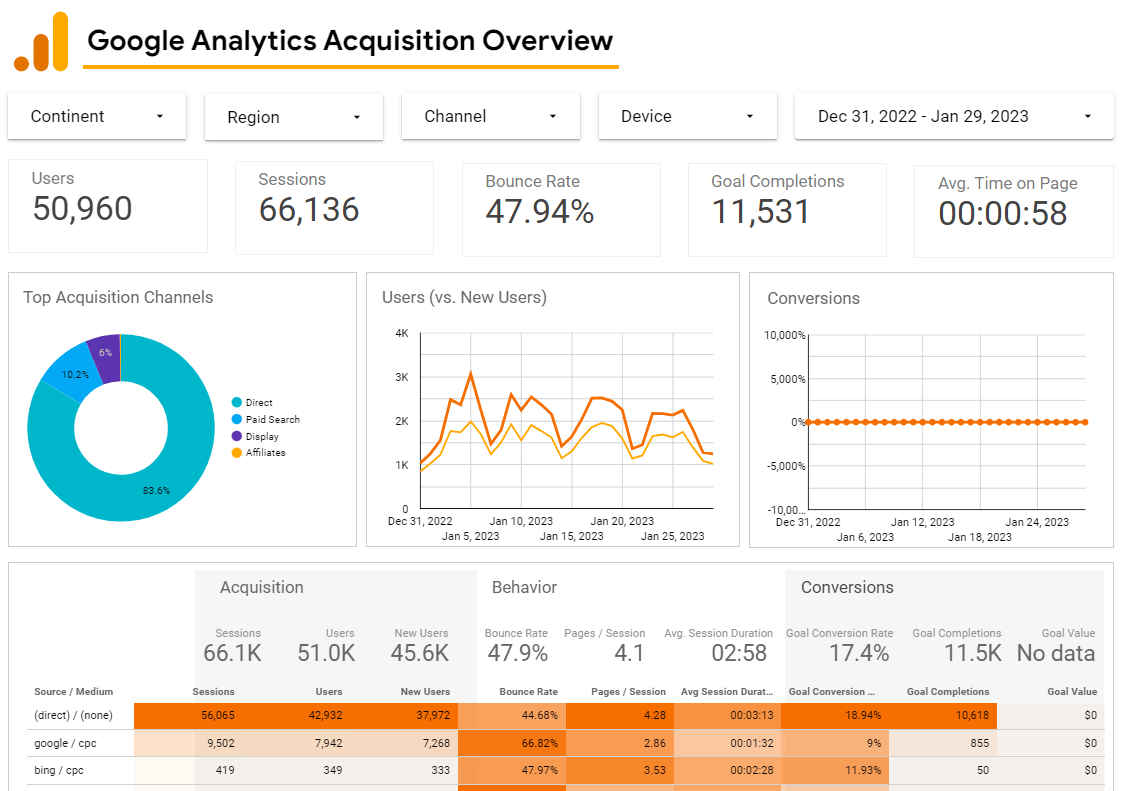
Reports are shareable so that other team members can edit, view and interact with your creations. You can edit simultaneously when you share a Data Studio report with another editor, making collaborative teamwork easy. You can add multiple data sources in the same report (e.g. Google Ads and Google Analytics data). You can also send these reports in scheduled emails.
Primary features include:
Interact with tables and charts
Explore data
Customise navigation bar
Multiple visualisation options
Customise widgets to match branding
Combine data sources
Share your report with others
Conversational Analytics in Google Data Studio
In 2026 Google Data Studio introduced Conversational Analytics, an AI-powered chat feature that allows users to interact with their data in a more natural, intuitive way. Rather than manually building charts or applying filters, users can simply ask questions in plain language and receive instant insights - making data exploration faster and more accessible for teams of all skill levels.
It's important to note, however, that Conversational Analytics is powered by Gemini, Google's AI model, and as such it is not a free feature. Usage consumes Gemini tokens, meaning costs will apply depending on the volume of queries made. Businesses should factor this into their reporting setup and review Google's pricing structure before rolling it out across their teams.
Connecting to your dataset
Connecting up to your dataset is made simple in Data Studio. Users are given a choice to:
Add data
Choose connectors
Specify data
Connect to multiple data sources
Blend data from different sources via a join
There are 22 native connectors built and supported on the platform, alongside over 1300 partner connectors! Chances are, if you have a data source you want to connect, there is an existing connector for it.
Things to consider
You start by choosing your connector (let's say Google Analytics).
You must specify your data, such as your GA4 reporting property or cell range (in a Google sheet). Connecting to multiple data sets in your report and blending data from different sources via a join is possible.
A join configuration links pairs of tables in a blend. There are two parts when blending - an operator, which determines how to combine the matching and non-matching records from the tables, and a condition, of the set fields that determines how the tables relate to each other.
Blending data in Google Data Studio
Data Studio supports the following join operators:
Left outer join - Returns matching rows from the right table plus non-matching rows from the left tables.
Right outer join - Returns matching rows from the left tables plus non-matching rows from the right table.
Inner join - Returns only matching rows from the left and right tables.
Full outer join - Returns all matching rows from the left or right tables.
Cross join - Returns every possible combination of rows from the left and right tables.
A word of warning: While blending data in Data Studio is an option, we have found that those connections are often not robust and can result in reports generating errors and analyst tantrums!
What is data storytelling?
Data storytelling is an approach to presenting information that makes it easy for an audience to understand and digest. It offers the chance to clearly convey insights drawn from a dataset by combining narrative with visualisations - with context playing a central role.
It's worth emphasising the psychological impact of storytelling - the way information is structured and delivered shapes how users identify what matters most. Confronting users with large, dense tables overwhelms the brain and hinders their ability to process what they're seeing.
We split data storytelling into four themes:
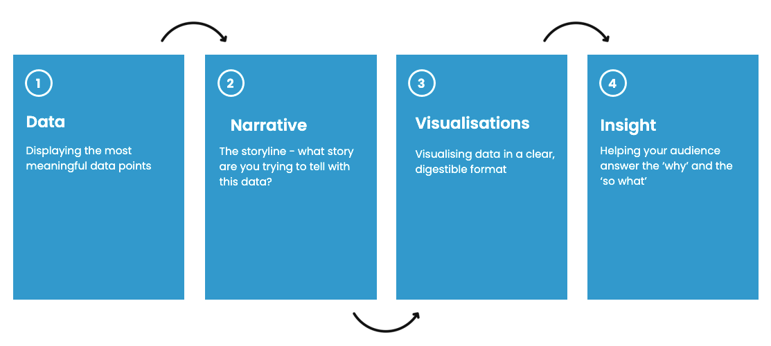
Data - make sure you display the most significant data points for the audience.
Visualisations - One size does not fit all, so carefully consider and choose a suitable format for your visualisation that will best tell the story and answer the primary questions generated by data.
Narrative – what story are you trying to tell with the data? Storytelling is a means of sharing information with your audience and transmitting the information in an easy-to-understand way.
Insight - the process of understanding opportunities from the data. Insights help the audience answer the ‘why’ and the ‘so what’ from the information presented.
3.Dashboard considerations
Think, plan, then act
Whatever you do, don’t start your dashboard with a blank canvas! Consider your audience, layout, customisations and metrics before creating your perfect recipe for your new dashboard.
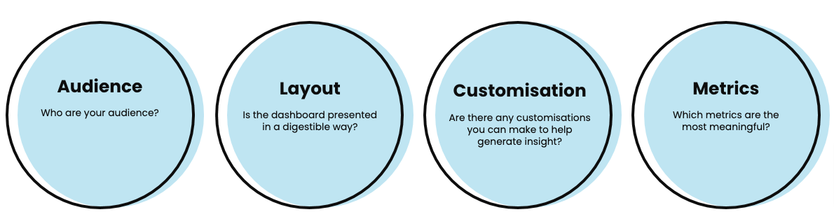
So onto some considerations to think about before you start building your dashboard. I would always suggest making a plan before opening your blank report – ensure you know what is going on in it. We should consider audience, layout, customisations and metrics to create the recipe for our dashboard.
Audience
Consider the following when thinking about audiences.
Who is your audience?
What are the business questions they want to answer?
Do they understand the different metrics and dimensions?
Can you format the data in an easily digestible way to help answer their common questions?
Can they make business decisions off the back of this data?
Layout
Make sure you format your dashboard/s in a user-friendly way. For example, spacing is crucial – make sure the widgets aren’t all cramped closely together.
Other considerations include:
What filters will my users need, e.g. device or country?
Can I break this dashboard out into separate pages?
Have I used the appropriate charts for the data being shown?
What colours am I using?
Should the dashboard reflect my brand colours?
Do the different dimensions on my charts stand out enough? i.e., don’t use two very similar shades of blue that make it hard for your audience to differentiate.
Customisation
When thinking about what customisations to add, consider the following:
Are there any dimensions that would be useful in a grouped format using a custom field?
Can you create any calculated metrics to aid users in their analysis?
For example, with a Google Ads dashboard, think about adding a calculation to demonstrate the campaign value and individual return on ad spend.
Metrics
Finally, what metrics will you share in your dashboard? Considerations include:
Which metrics matter to my dashboard users?
What are the company KPIs and which metrics funnel into these?
Have I asked the stakeholders/users of my dashboard which metrics matter the most to them? It's important to remember that just because all metrics are available does not mean they all have to be displayed.
4.Dashboard best practices
Make Data Studio quicker and easier
Some of these are a bit of housekeeping and may seem obvious, but they will help make using Data Studio quicker and easier.
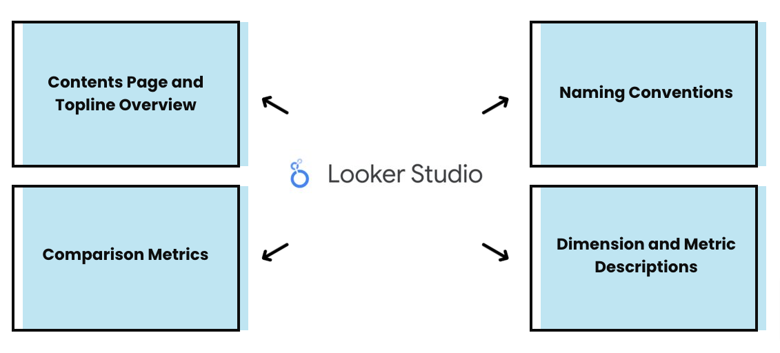
Contents page and topline overview - helps users quickly navigate to the page they need. Topline overview provides a snapshot of the most meaningful stats enabling users to see helpful information at a glance.
Comparison metrics - We can tell users a number, e.g. sessions last week were X. But, so what? Data Studio has a simple feature where you can show the variance either against the same period in the previous year or against the timeline you selected. You can customise the colours of the variance; for example, if the bounce rate has increased by 50%, you can show it as red. This helpful feature quickly helps give context to help users understand the story of the data and drill down into the 'so what' or the 'why'.
Naming conventions - This tip is 101 and obvious, but make sure all your dashboards follow the same naming convention. Data Studio can become quickly cluttered, and a uniform naming convention saves time searching. We recommend the same for data sources. Make sure everything follows the same naming pattern.
Dimension and metric descriptions - Sometimes (it's fair to say), end users are not always data savvy or in the granular detail to know what specific metrics or dimensions mean. It's helpful to outline definitions and context in reports for users. Use tooltips so that a user can hover over a metric or dimension to get the data's meaning.
5.Data Studio tips
Handy hacks and tips for success
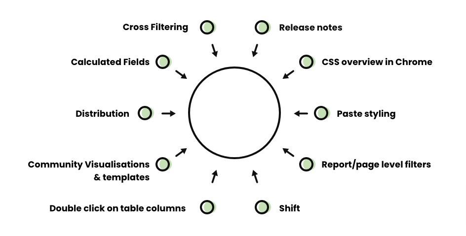
We're sharing these useful little hacks to help you get the best from Google Data Studio. Once you know them, it makes the tool much easier to use.
Cross-filtering - Use a chart to cross-filter into other charts to interact with a subset of data. For example, select 'paid search' from the marketing channels table and all other charts will update to display paid search data only. You can toggle this feature in the 'Style' tab.
Release notes - Google Data Studio is constantly releasing new features. We recommend keeping up to date with the release notes to stay on top of what's new. Don't forget to share knowledge with your team too, you'd be amazed at the tricks others have picked up along the way.
CSS overview - Need your brand colours? Right-click and select 'Inspect' in Chrome on a relevant page, then navigate to the CSS Overview. This will surface the HEX codes for all colours used on the site, ready to apply to your reporting dashboards.
Paste styling - Want to replicate the format of a widget? Copy it, navigate to the new widget, then right-click and select 'Paste style' only. This retains the underlying data while applying the original widget's styling, a real time-saver when applying consistent formatting across multiple charts.
Report and page level filters - Rather than applying filters to each chart individually, set them at report or page level. Useful for scenarios like excluding internal traffic or a specific browser from all charts in one go.
Shift key shortcuts - Arranging widgets can be fiddly. Hold 'Shift' to select multiple charts at once, avoiding the need to move them one by one. Use 'Shift + arrow keys' to nudge widgets in smaller, more precise increments.
Double-clicking table columns - To evenly space your table columns without manually dragging each one, simply double-click and they'll align automatically. Simple but effective.
Community visualisations and templates - There's a wealth of visualisations and templates built by the Data Studio community. A great example is the 'tooltip for metric descriptions' visualisation, which displays a metric description when a user hovers over the info button. Templates are also a brilliant starting point when building a new dashboard from scratch.
Distribution and alignment - Keep your reports clean and professional by ensuring widgets are evenly spaced and aligned. Head to Arrange and select 'Align vertically' or 'Align horizontally' as needed.
Calculated fields - Marketers can create custom metrics that aren't available by default. For example, dividing revenue by transactions to calculate average order value. Navigate to 'Add metric' and select 'Create field'.
Blend data sources - Data Studio allows you to blend multiple data sources into a single chart, which is particularly useful when you want to compare performance across platforms side by side. Use the 'Blend data' option when editing a chart to join sources using a common dimension such as date.
Scheduled email delivery - Reports can be set up to be delivered automatically via email on a daily, weekly or monthly basis. This is ideal for keeping stakeholders informed without them needing to log in. Look for the 'Schedule email delivery' option under the Share menu.
Keyboard shortcuts - Familiarise yourself with Data Studio's keyboard shortcuts to speed up your workflow. For example, 'Ctrl + D' duplicates a selected widget and 'Ctrl + Z' undoes your last action, small habits that add up over time.
Conversational Analytics - If you have Gemini tokens available, take advantage of the new Conversational Analytics feature to query your data using plain language. Rather than building charts manually, simply ask a question and let the AI surface the insight. Bear in mind this is not free to use, so it's worth reviewing usage with your team.
6.In summery
Powerful data tool
Data Studio is a fantastic tool to help you with data storytelling. We recommend you start experimenting and see how quickly you can build brilliant dashboards to help you share what is happening in your organisation.
We can support you with your data reporting needs; call us on 01903 285900, send us a quick message or use the form below.
7.Watch our bitesize learning
8.Data Studio FAQ
How can I get around the GA4 quota limit?
This is pretty rare these days but if it does happen frequently, we’d recommend getting set up on BigQuery or using a data extract from GA4 rather than the GA4 API.
Can I monitor my organic search rankings with Data Studio?
Yes, you can do this via the Google Search Console connector. You can add a dimension for your organic search queries and then a metric for the average position. You can plot this over time with a time series chart and a filter for a specific search query or even use a custom field to define if these are brand or non-brand. You can also plot this in a table with a comparison metric to show period over period or year-on-year variance in rankings.
Can I easily share access to my dashboards with others?
Yes, you have multiple options when it comes to sharing. You can add other users as viewers or as editors and you can also share a PDF version of the dashboard via the Share menu, by selecting 'Download Report'.
There is another handy option in here - Scheduled Delivery, which you can use to automatically drop the PDF report into your manager's inbox every first day of the month, every Monday or every day if you want to really grab their attention! Don't worry, they have the option to opt out of receiving them via the email.
Just bear in mind that anyone wanting to access your dashboard needs to either have a Gmail address or must have registered their work email address with a Google account.
Is there a Meta / Facebook Ads connector in the same way there is a Google Ads connector?
No, there isn’t a built-in Facebook connector. There is a Supermetrics partner connector for Facebook ads, so it’s worth looking into a Supermetrics license as an option if you want to import this data. There are many providers of this type of data pipeline, Supermetrics is a reliable one we would recommend.