How to optimise your website navigation
Analyse, design and test your website menu in six simple steps.
 Stephen Courtney
1.Introduction to optimising your website navigation
This process provides a systematic approach to restructuring your website's menu. It's a simple method that produces an evidence-based solution, which means you avoid stakeholder turf wars, guesswork, and design by committee.
We've used this process across many sectors, and the outcomes have been remarkable.
In my opinion, I suggest that your menu is perhaps the most important piece of content on your website.
Another reason for prioritising your menu is that it has relevance for every avenue of optimisation.
Menus have a crucial role in structuring your site for users (by organising your content) and crawlers (by structuring your internal links). They are the principal means for answering every visitor's questions when they land and how most visitors will find the products or services they want.
The following graphic describes a simple way to think about browsing behaviour. Across the top are two extremes of attention (high or low), whilst the horizontal dimensions reflect the user's goals.
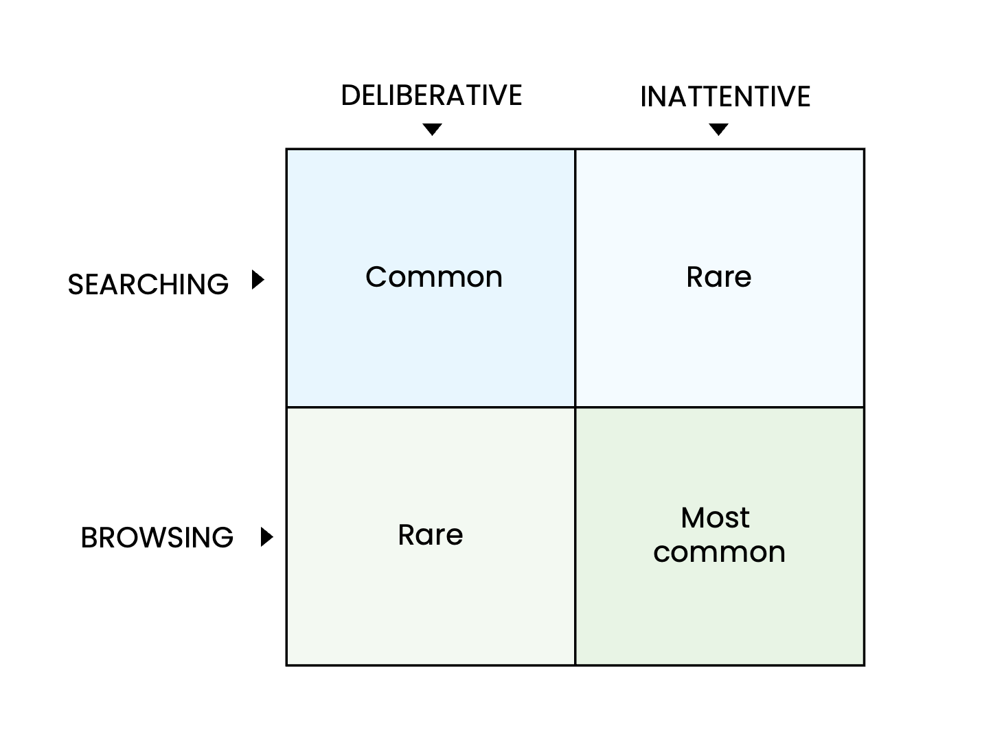
These two qualities are linked, so it's rare to get someone searching for something specific inattentively. The most common form of browsing is in the dark green square.
An optimised menu will help attentive searchers find the answers and direct casual browsers to your most productive pages. In SEO, UX and CRO, optimisation is helpful in the following ways:
- SEO —
- Highlights key content for users and crawlers
- Defines areas of expertise
- Organises internal links
- UX —
- Meets user needs and expectations
- Puts content in context
- Shows hierarchies and relationships
- CRO —
- Improves product and service discovery
- Shortens the journey to a purchase
- Reduces frustration
So, your navigation menu is crucial, and there are multiple benefits to having an optimal solution. But how do you find the best solution? We can help. The following six steps will take you closer to a navigation utopia and user-friendly website menu.
Content analytics
Card sorting
Tree testing
Click tracking
Design and build
Analysing your results
Read on to discover how to apply them, along with a range of best practice tips and tricks.
2.Content analytics
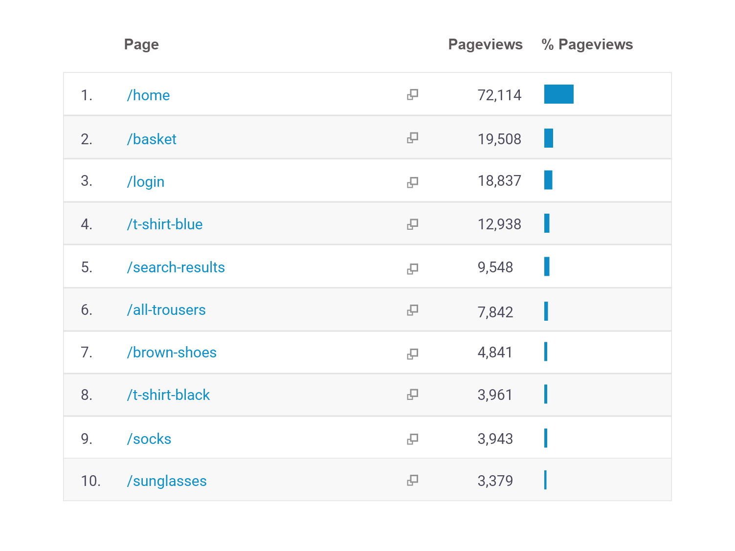
The distribution of page views, and high-value pages, should inform your menu design
Learn what visitors do
Website analytics will tell you which pages are most popular, which account for the most entrances, and which contribute to a lot of sales.
By analysing your top 50-100 most-viewed pages, you can calculate average scores for each menu category for the following metrics:
Page views by channel
Assisted conversions
Landing page sessions
Value leakage
Learn what visitors want
Alongside the performance of your existing content, your new menu should reflect search engine data. Combining the search terms that lead customers to your website with global search volumes will help you find category labels that will attract browsers and strengthen internal linking.
3.Card sorting
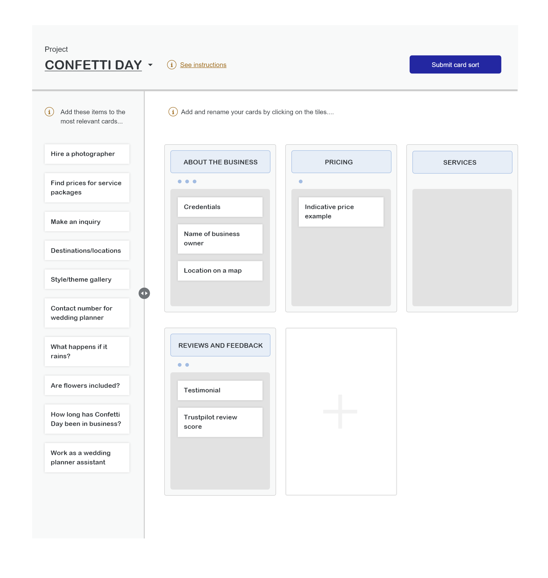
Card sorting exercises show how users expect website content to be organised
How it works
Participants are given 'cards' representing website pages and must sort them into helpful menu categories. Then each person must label each category with an appropriate heading.
Don't hesitate to repeat the exercise with different rule sets (for example, using a maximum of five categories). Participants may also be encouraged to group cards when they feel the information should occupy a single page.
Although you might not implement any of your participant's structures directly, common preferences and trends will show which groups are the most intuitive.
Choosing your participants
Card sorting can take place in person or online, so there is no need to limit your sample by location. However, the participants should be representative of your website's users and will ideally cover a wide age range.
Useful rules
Use a maximum of six primary categories
Ensure no item fits in more than one category
4.Tree testing
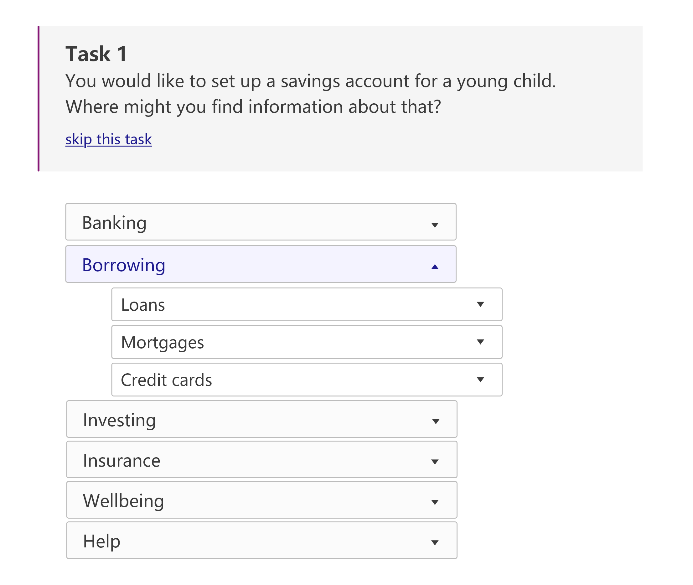
Tree tests show how easily users can navigate your menu structure
How it works
During tree testing, participants are given hypothetical scenarios and asked to complete tasks by navigating a ‘tree’ of headings and subheadings (which represent categories and pages).
How to analyse a tree test
By keeping a log of navigational errors and incomplete tasks, you can evaluate two aspects of the information architecture:
Organisation – Are the pages in categories that users find natural and intuitive?
Labelling – Are the sections labelled in a way that makes their purpose clear?
Minimum sample size
Some UX practitioners recommend using a minimum of around 50 participants. However, you can often see inciteful trends developing within a smaller sample.
5.Click tracking
Creating click events for each menu item lets you analyse interactions
Google Analytics and GA360
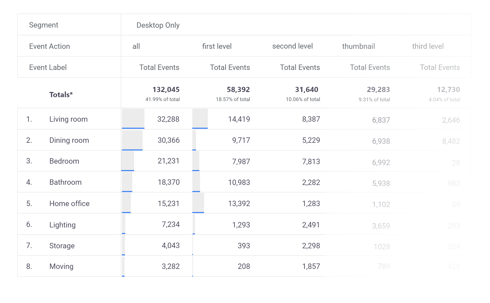
A standard Google Analytics view allows you to create events with three dimensions: Category, Action, and Label. By codifying your events in advance, you can generate analytics reports that compare menu clicks at every scale. For example, a retail website might create the following event for their t-shirt menu item:
Event Category = menu clickEvent Action = level 3, men, clothing, by productEvent Label = {{Click Text}}
Google Analytics 4
Google Analytics 4 allows you to create events with up to 50 custom dimensions, making it much easier to codify your click events. However, you still need to plan an organisational schema in advance so you can view all relevant information in one report.
6.Design and build
Build your new menu and A/B test it against the current version
If your new menu has a different structure (for example, a drop-down mega menu or a new level), you will need design solutions for the new elements. These designs should identify the breakpoints that determine how the menu will appear on small screens and mobile devices.
Any proposed solutions should be user tested as design prototypes before you build the test so that minor bugs and oversights don’t complicate your data.
Development
Menu testing is complex and requires development expertise. It's imperative to test the code and ensure it functions as expected on various browsers and devices.
NB. Before launching, ensure the tracking on the variant menu uses the same events as the original to allow comparison in your reports.
7.Analysing your results
Combine test data with your other research insights to establish a “story”
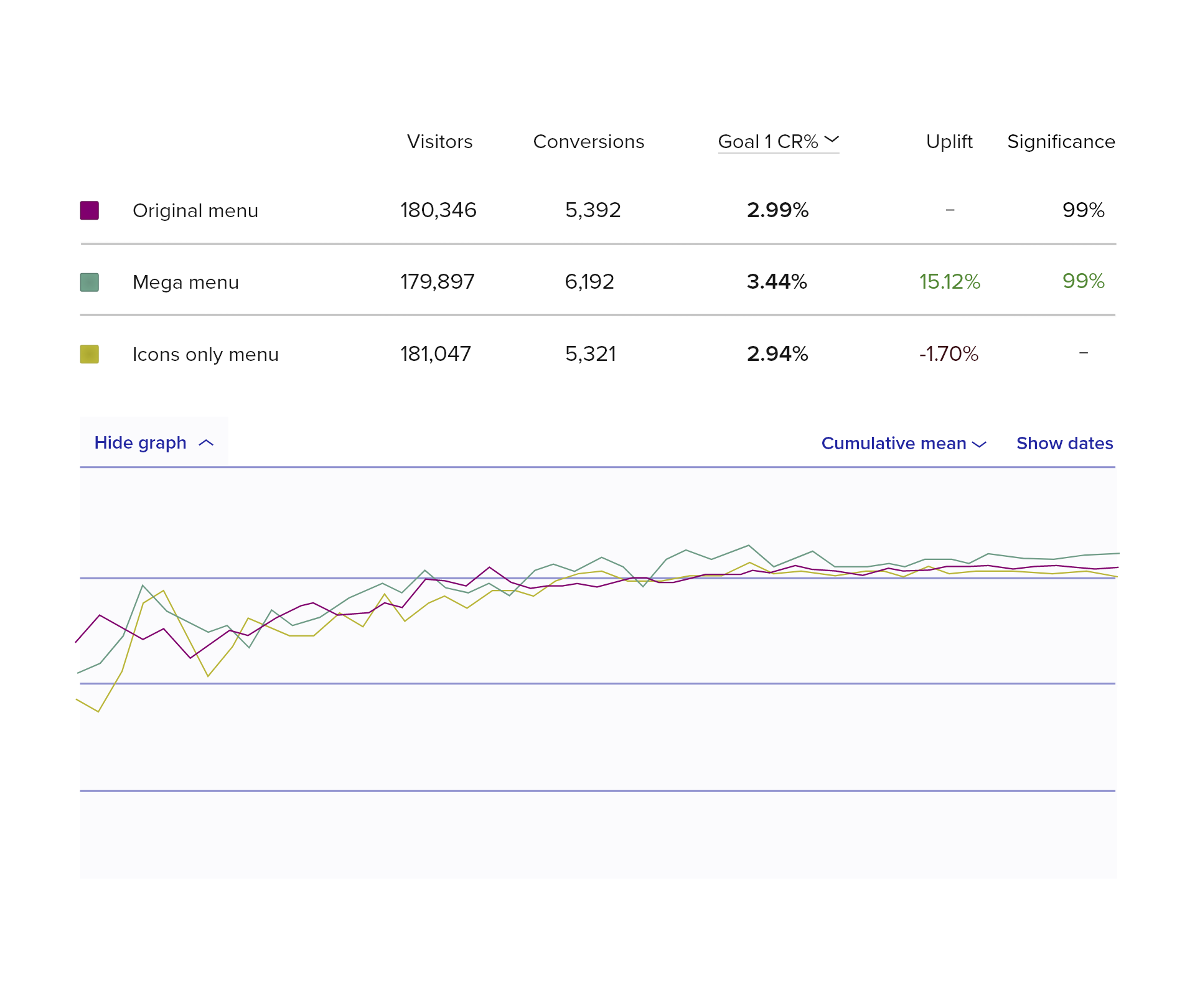
Interpreting A/B test data for a menu redesign is complicated because you need to consider commercial metrics (such as conversion rate), engagement metrics (such as search depth), and user experience.
How to analyse your data
Use commercial KPIs (like sales or sign-ups) to monitor and call the test. You can also compare usage statistics for each variant if your site has a search bar.
Comparing the top 20 most visited pages and most clicked menu items for each menu version will help you identify changes in navigation behaviour.
You can calculate which menu version encourages deeper sessions if your menu has multiple levels.
Comparing your A/B test results to your tree testing and user testing insights will give you more confidence in any trends that seem consistent. These trends will allow you to tell a story about how the alternative menu has changed your users’ behaviour.
8.Watch our bitesize learning

9.In summary
If you want to optimise your website menu and navigation, our six steps provide the framework for creating an optimal solution.
If you would like help with the process, call us on 01903 285900, or send us a quick message about improving your website navigation or use the form below.