
The ultimate guide to CRO and the customer journey
Find tips on awareness, research and consideration, and the transaction stages of the customer journey.


Think of the customer journey as a first date, everything needs to be perfect, or you won’t get a second chance. You must turn that first impression into a lasting one, which is where conversion rate optimisation comes in. We'll take you through how CRO principles can improve performance and reduce resistance across the various stages of the customer journey.
In this guide, you'll find over 25 conversion optimisation tips to help reduce friction in the customer journey. Split into three parts, each section contains key tips to enhance your knowledge of the customer journey and how you can utilise CRO to improve performance.
The 10 stages of the customer journey
Section one: Tips for the awareness stage
Utilise the following 7 steps to optimise the awareness stage of the customer journey
- Address user needs in simple, familiar language
- Strategically frame your product
- Associate yourself with well-known people and brands
- Use content and quotes from authority figures and experts
- Remove blockers and distractions
- Make a great first (and last) impression
- Be bold and striking
Successful conversion rate optimisation (CRO) is a science – a chemistry of strong audience knowledge mixed with optimised content, layout and navigation that increases persuasion, lowers fear and removes blockers from your design.
It’s about easing the path to conversion from that very first date.
In section one, we look at key CRO principles that apply when users already have awareness of your brand. We’ll then highlight some typical CRO techniques you can consider at this stage.
1. Address user needs in simple, familiar language
We crave simplicity. The speak-easy effect shows words that are easier to say are more trustworthy.
Studies have also shown that we (humans) place a higher risk on words that are hard to pronounce. Keep it simple for a better impact.
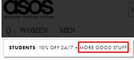
“more good stuff” - asos use familiar and simple
language to address customer needs within three CTAs.
2. Strategically frame your product
We react to choices differently based on how they’re presented (framing effect). Context and tone will affect your audiences’ perception.
We avoid risk when a positive frame is presented, and seek risks when a negative frame is presented. Think about the action you want your customer to perform, and use positive or negative language to frame your product or service.
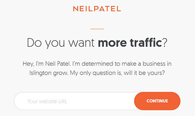
Marketer Neil Patel strategically frames his service
as focused, determined, familiar and relevant (local)
3. Associate yourself with well known people and brands
Familiarity is our friend. We tend to like things and people we already know and are fond of – so partnering with respected people and brands in your industry will lift your brand image and bring affinity between the two, known as the Halo Effect.
(See also: In-group bias, Out-group homogeneity bias, Cross-race effect, Cheerleader effect, Well-travelled road effect, Positivity effect)

Waitrose associate with the familiar and highly
respected chef Heston Blumenthal
4. Use content and quotes from authority figures and experts
We place high value to opinions of authority figures and experts (authority bias). Use quotes from relevant personalities to align your brand with their values and make your company more authoritative or relatable.
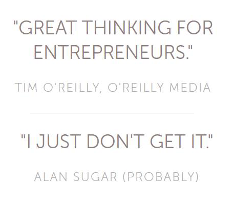
The Happy Startup School uses quotes from authority figures – a common technique.
The funny (fake) quote will increase the users' ability to recall the brand (Humour effect)
5. Remove blockers and distractions
CRO is all about easing the path to conversion on your site – improving navigation, adapting calls-to-action, optimising design, and content. Every element on a page will distract from others, so it’s a good idea to review all pages key to the awareness stage to remove all blockers and make sure info is easily found and engaged with.
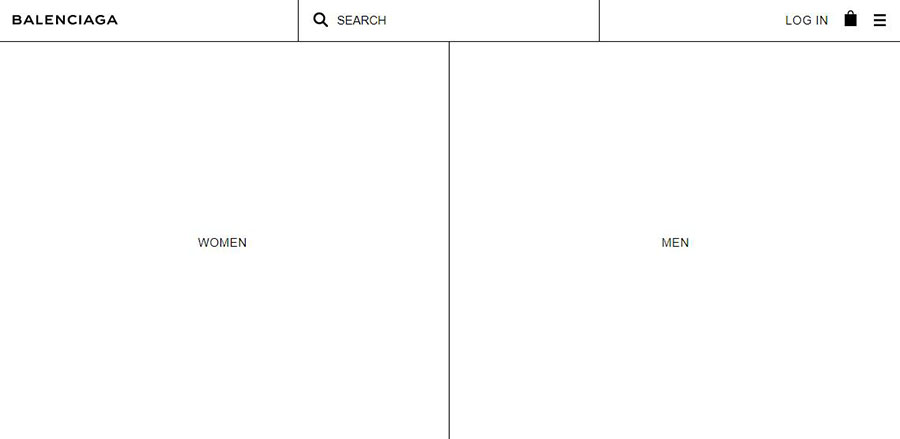
The Balenciaga online shop incorporates pure simplicity into their branding,
allowing for a distraction-free shopping experience
6. Make a great first (and last) impression
Items presented first are easier to remember (primacy effect). Items at the end of a list, or experience, are also recalled easier (recency effect). Put these principles into practice on your site and be strategic about what the user experiences at the beginning and end of their user journey.
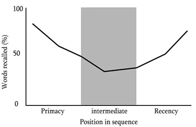
We remember the beginning and ends more easily than the middle.
Virgin Holidays employ the primacy effect by heavily promoting ‘sale’ items when a user begins holiday hunting. This instills confidence in their prices at a memorable part of the customers’ journey.
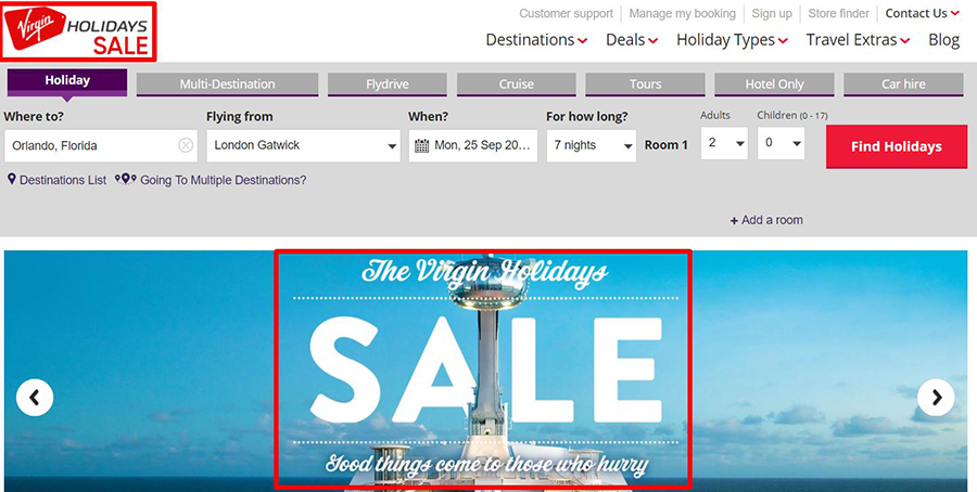
Virgin holidays heavily promoting ‘sale’ items when a user begins holiday hunting
(exploiting the Primacy Effect).
7. Be bold and striking
Brands that stand out are more memorable. We notice bizarre, funny, visually-striking and anthropomorphic design (design which reflects human-like qualities). Employ striking visuals and humour to your designs to be remembered.
See: bizarreness effect , Humor effect, Von Restorff effect, Picture superiority effect, salience bias.

At one stage, PurpleBricks employed the Von Restorff effect with bold and striking imagery.
This helped them differentiate and become a memorable brand.
First dates done right: improve the customer experience as they discover your brand
As the recency effect dictates, your customers are likely to remember their first experience with your brand – so make that a lasting one. Be strategic, provide a great first impression, and make it easy for customers to progress to the next stage (research and consideration).
It’s essential to test big design changes to measure how they alter your user experience and behaviour. Using our test and learn approach and customer-centric thinking in CRO, we help clients improve their customers’ experience and ultimately, their business’ bottom line.
Do you need help understanding your customer journeys?
Section two: Tips for the research and consideration stages
Consider these 10 ways to optimise the research and consideration stages of the customer journey
- Highlight low stock, scarcity and exclusivity
- Use repetition
- Keep choice and variety low
- Show relationship to trusted brands
- Be likeable
- Show high prices first
- Offer immediate benefits
- Show your social responsibilities and impacts
- Show consensus and ratings
- Less is more - keep it simple and distraction-free
So what’s next? The customer is through the door, familiar with you and engaged with your brand. Now, with a problem, desire, or need to fulfil, they move into the research and consideration stage.
This is where they scour your website and digital channels to learn more about you and compare you against your competitors. Understanding your audience’s intent and how your website caters for them at this stage of their journey can uncover a wealth of opportunity. You’ll be able to better improve their experience of your brand and streamline their path to the purchasing stage. In section two we look at CRO principles to optimise the research and consideration stage of the customer journey.
1. Highlight low stock, scarcity and exclusivity
We place value onto rare items (scarcity heuristic). We also place greater value when there are barriers to entry – like members-only access.
Consider how to employ exclusivity and limited access to your campaigns and content.
Highlighting rare items, low stock, and exclusivity will not only increase their perceived value, but also help users discover and obtain something ‘special’ that may not be available in the future.
 Wine retailer Majestic have created a whole area to highlight wine that is both limited in stock
and rare (once-off availability). This helps increase the product's perceived value.
2. Use repetition
We develop a preference for things after repeat exposure. Repetition also increases our familiarity with brands (mere-exposure effect). Use repetition with caution; a study suggests that repetition has a positive effect for a period, and then begins to have a negative effect (Berlyne, D. E. 1970).
Remarketing to website visitors with display ads is a powerful method to gain repeat exposure and mindshare of your audience.

Clever use of repetition by McDonald's
3. Keep choice and variety low
Too much choice is paralysing and leads to indecision and lower sales (choice paradox).
Adobe’s Brand Director of Product Marketing, Kevin Lindsay, recommends finding the balance. Kevin argues that there “needs to be a balance between choice and hyper-relevance” warning not to cross the line between freedom of choice and big-brother style customisation.

Clothing retailer MM.LaLfeur devised a retail model around removing choice, by allowing users to skip the shopping experience altogether and receive pre-chosen outfits.
4. Show relationship to trusted brands
We’re more likely to adopt beliefs if more people hold that belief. We’re also more likely to value the opinion of authority figures and be influenced by them (known as ingroups , social proof, authority bias).
Showcase relationships with familiar and trustworthy brands, for example brands that have featured or recommended you.

Van leasing specialists Vanarama show their likeability by displaying logos of media their audience will trust (have authority) and be familiar with.
5. Be likeable
It may seem obvious that we’re more likely to gravitate towards and do business with people and brands we like (liking principle), but it’s true.
Importantly, this bias also includes:
- Physical attractiveness
- Similarity to ourselves
- Associations with other people or brands we like
Associate yourself with likable, established and trustworthy brands (or people) and highlight your partnership with them on your website and via your content.

Diageo’s Haig Club whisky uses the 'liking bias' by associating their product with the legendary footballer David Beckham.
6. Show high prices first
We rely too heavily on the first piece of information seen. A high price for one item makes other items seem cheaper (anchoring bias).
Consider how your first shown prices frame your pricing.
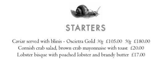
The Savoy Grill menu lists the most expensive item first,
this allows other items to feel cheaper
7. Offer immediate benefits
We like to return favours and are more likely to comply with future requests after being offered something first (reciprocity).
We prefer a smaller more immediate payoff now, rather than a larger gain later on (hyperbolic discounting). Consider offering a premium delivery option to afford your users' immediacy and give instant gratification.
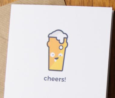 YamYam greeting cards offer immediate benefits
by offering a free birthday card
8. Show your social responsibilities and impacts
We see products of genuinely caring companies as superior (the Noble Edge Effect). In fact 81% of millennials expect companies to make a public commitment to good corporate citizenship, as reported by Horizon Media’s study.
Showcase charitable endeavours and positive impacts you’ve made.

Banks frequently use the Nobel Edge Effect to improve their public image
9. Show consensus and ratings
We look to the actions of others to help determine our own and we have a tendency to conform with other people and flock together (Social proof, conformity, herding, bandwagon effect ).
Dr. Robert Cialdini highlights consensus as one of the six key principles of persuasions.
Employ consensus at the research stage of the customer journey by:
- Showing product ratings (popularity) and testimonials
- Showcasing additional products that customers also bought (e.g. “customers who bought this item also bought”)
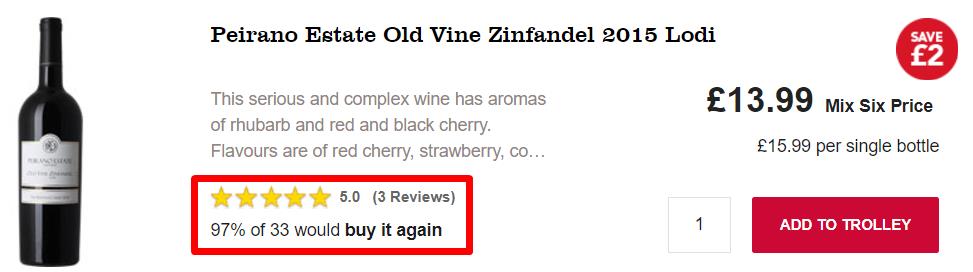
Wine retailer Majestic clearly displays consensus by showing a rating and how many customers would buy it again.
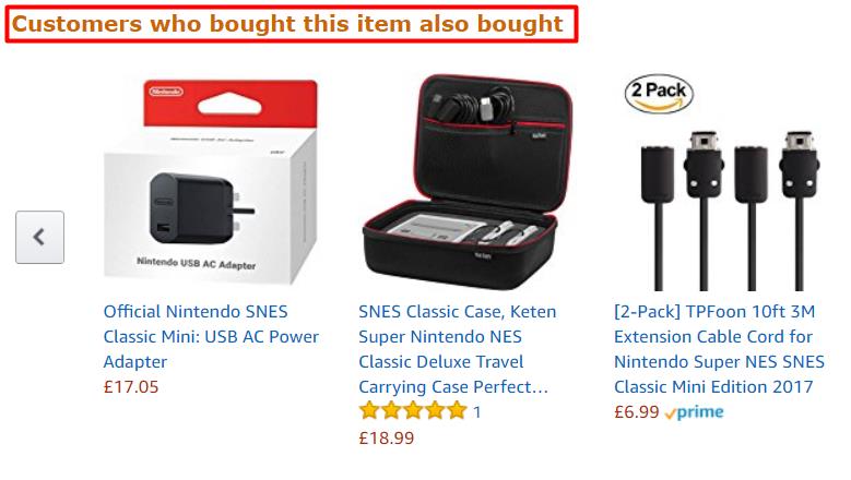
Amazon utilises the consensus principle by highlighting
additional products that customers also bought.
10. Less is more - keep it simple and distraction free
We give up on tasks when faced with information overload or complexity. Additionally, every extra element on a page competes with other elements, diminishing their relative visibility (10 usability heuristics).
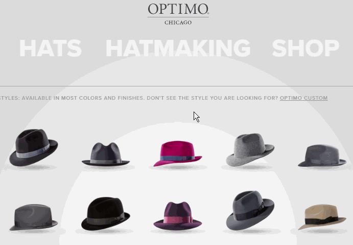 Hatmaker Optimo employs simplicity by letting their navigation take a back seat. The hats take centre stage. When the user requires navigation, it gains contrast and focus.
Optimising and measuring the impact
At Fresh Egg we have tested many of these techniques and seen fantastic results for our clients. For example, we have seen a 69.9% increase in revenue and a +11.9% increase in orders by adding a “Customers also bought” section to an e-commerce product page.
While these principles are based on scientific research and studies, user behaviour should still be monitored when applying these to your designs. Split-testing design updates will help you learn about your audience and what’s important and persuasive for them.
Employing a test and learn approach to your designs allow you to continually gain insight and optimise your offering to directly meet the needs of your audience.
You can be reactive, proactive, and responsive – every customer’s dream in the ever-changing digital age.
Section three: Tips for the transaction stage
10 ways to optimise the research and consideration stages of the customer journey
- Run surveys to understand your user’s language, needs, and fears
- Show clear prices and fees
- Ensure experiences are fast
- Analyse the checkout process and optimise forms
- Keep your checkout process simple and distraction-free
- Convey security and trust
- Make voucher code input areas less visible, or invisible
- Start with small easy tasks, and show progress
- Ensure the transaction ends on a high
- Add personalisation
Have you ever wanted to buy something so much, that you didn’t care how painful and time consuming it was to buy? Maybe the item was only available on one poorly optimised website, and you had to persevere through usability hell to purchase.
You fought and stumbled through:
- Re-completing forms
- Calling customer support
- Setting up an account with a password that Einstein would be impressed by
Ten points for dedication. But most of your website users won’t be up for wading through such friction. Here, we'll look at CRO tips to optimise the user journey through the purchasing stage, using some techniques we employ here at Fresh Egg to improve customer experience and ease purchase decisions.
1. Run surveys to understand your user’s language, needs and fears
Surveying your users at different stages of the purchasing process will help uncover what may be hampering their journey of checking out.
For example:
Survey users before checkout, especially if you can target those who appear to be on the fence about purchasing. Be careful you don’t put them off making a purchase – this survey shouldn’t be intrusive and it’ll be key to monitor user behaviour.
You could ask, Did you find everything you were looking for? Or; Do you have any concerns before purchasing today?
Survey users after they’ve checked out, and before the thank-you page.
You could ask, What convinced you to buy? Or; Was there anything that made you hesitate before buying?
💡Top tips for running surveys
If you have high traffic, try an optional survey accessible from the corner of a page. If you have low traffic, try a modal overlay popup – but monitor for performance impacts.
A modal popup can return 8x the response rate vs. an optional survey positioned in the corner of the screen, but should be used with caution:
- Ensure users can easily exit the modal and that it doesn’t hurt their experience (keep track of this by monitoring the exit rate of users).
- Ask no more than three questions, ideally ask only one or two.
- Ask open-ended questions to uncover honest answers.
- 500 useable responses should be more than enough to deliver actionable insights.
At Fresh Egg we utilise surveys alongside other research methods to feed into a prioritised conversion optimisation test plan.
2. Show clear prices and fees
As shoppers, we dislike unexpected additional costs. In fact it’s the number one reason for abandoning a checkout (source). Reassure shoppers with no hidden costs and smart messaging.
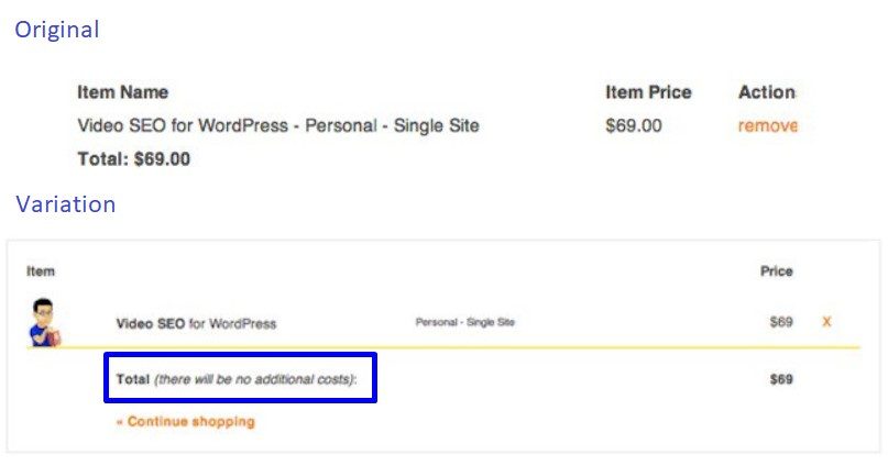
Yoast added copy showing “no additional costs”. This, together with additional improvements, produced an uplift of +11.30% in conversions.
3. Ensure experiences are fast
Studies show high consumer expectations for page load times – just two seconds. A performance difference of just 0.25 seconds is enough to make or break a web experience for the user – therefore providing a competitive advantage for the business.
And it’s not just page load times that matter – the speed of other on-page elements is also key to success. If you employ an auto-suggest search box for example, ensure it is just as lightning fast as the rest of your site.
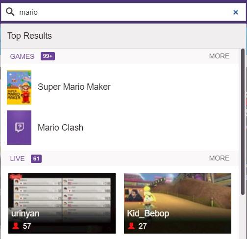
Twitch.tv provide a great example of a fast auto-suggest that with a variety of useful results
4. Analyse the checkout process and optimise forms
Uncover areas of friction on forms with Google Analytics or better yet, specific analytics software. At Fresh Egg we’ve greatly improved forms and user purchasing experiences thanks to analytics insight tools like Hotjar and Formisimo.
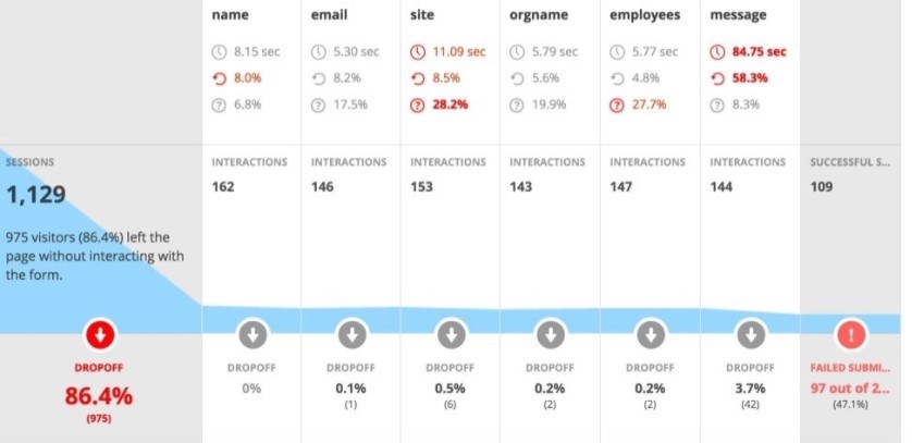
Specialised form tracking tools can quickly uncover areas to optimise your forms (above: Hotjar form analysis)
Nielson Norman highlights 10 best practices to follow for form design – employ as many of these as you can to fully optimise the forms within your checkout process.
5. Keep your checkout process simple and distraction free
Our attention span has fallen from 12 seconds to 8 over the last 15 years. It sounds obvious, but checkout needs to be smooth, simple and distraction free.
Long and complicated checkouts will hamper conversion rates. A US study has shown 27% of online shoppers abandoned an order solely due to a “too long / complicated checkout process”. The same study showed an ideal checkout flow will contain only 7-8 input fields, yet checkout flows on average contain 15 input fields (source).
Aside from removing unnecessary form fields, a typical method of speeding up the checkout process is to offer registration at the end of the process (after payment) as opposed to before, or integrating third parties such as PayPal.
6. Convey security and trust
We’re more likely to buy from companies and checkout processes that we know and trust (Authority bias). Use copy and imagery to convey security, trust and authenticity.
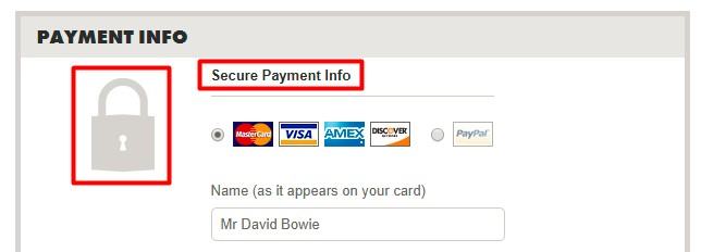
Threadless.com convey security and trust through both language and imagery, at the payment stage of the checkout journey
7. Make voucher code input areas less visible, or invisible
If we think we’ve missed a special offer, we’re less likely to buy (inaction inertia effect). Additionally, if a user notices a voucher code field during checkout they may leave the process to find a code and abandon the task of purchasing altogether.
Some steps to avoid these pitfalls:
- Applying voucher codes automatically , and notifying users during checkout
- Significantly decrease the visibility of the voucher code input (for example using a text link)
In one case study, Fresh Egg achieved a 12.9% increase in conversions by de-prioritising the voucher code area and improving the copy on a client’s checkout page.
8. Start with small easy tasks, and show progress
We are more likely to commit to larger tasks if we have performed smaller actions already (Commitment bias). Consider your checkout process: are the first steps clear, quick and simple? Dr. Robert Cialdini highlights the commitment bias as one of six key principles of persuasions.
Our efforts increase as we move closer to our goal (Goal gradient hypotheses). A 10 space coffee card with two pre-completed stamps will be completed faster than an 8 space coffee card with no stamps.
Does your reward scheme offer an initial free bonus, or holiday bonuses?
Does your checkout process convey the distance to purchasing?
9. Ensure the transaction ends on a high
We mostly judge experiences on their peaks or by the end of the journey (Peak-end rule). You should consider how to delight your customers after their purchase. Be it at the confirmation page, the email receipt, or when they receive your product.
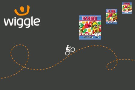
Retailer Wiggle employ the peak-end rule by including a small packet of sweets within every order
10. Add personalisation
Personalisation has become crucial for driving customer acquisition, engagement, retention and an increase in conversions. Classic conversion optimisation focuses on providing the best experience for the average user, but is evolving with the tide of personalisation. Injecting customisation and tailored content into your design will take you to the next level.
Examples of ecommerce personalisation:
Shopping cart abandonment emails
Sending automated shopping cart emails to users who have abandoned the site have always been a smart tactic to encourage them back to complete the purchase.
Product recommendations
Diving into user data to show personalised product recommendations in the shopping cart or on product pages based on previous interactions.
Do you have a challenge we can help with?
Let's have a chat about it! Call us on 01903 337 580