
Five Considerations for Mobile User Experience (UX)
Effortless engineering – the ultimate oxymoron?
Good user experience design (UX) is about creating a seamless, logical and natural pathway around your website. In a world of information overload, our ever-reducing attention spans crave simplicity and space.
UX design puts the user centre stage and caters for this need. It understands their journey and answers their intent – often before they even realise it needs answering – with intuitive navigation, clear signposting and engaging, readable content.
On mobile, the fluidity and ease of this journey is even more crucial. There are two sides to the UX coin. The ultimate oxymoron: a streamlined, effortless user experience, but one that’s intricately engineered by your design and development teams.
In the mobile UX world, nothing is accidental. With that in mind, here are five considerations when designing mobile UX on your site.
1. One-handed operation & thumb-friendly design
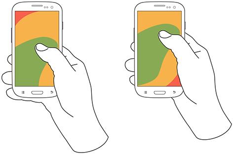
Studies show that most people hold their phones in one hand , using their thumbs to navigate – so thumb-friendly design is a must. Everything should be accessible with a simple touch, swipe or scroll, including buttons, menus and other navigational elements.
The below heatmap diagrams show the reachable thumb zones on a screen with one-handed operation: green is easy access; yellow is a stretch; and red needs a full shift of position to reach.
A shift of position means effort for the user – and effort is something that good UX design will always try to minimise.
Put yourself in your customer’s shoes and think about what you want from your mobile experience. Having to pinch, zoom and repeatedly tap your way around to properly read or use a menu can be frustrating, and make you want to leave a site.
Things to consider:
- Place primary actions near the bottom of the screen (in the green zone).
- Use fixed positioning to keep calls-to-action present and easily accessible whilst browsing (this is great for search filtering).
- Make buttons and links (touch targets) at least 44px X 44px as recommended in Apple’s human interface guidelines.
Kayak uses both the filter and toggle for map view fixed at the bottom of the screen, removing the need to reach to the top of the screen.
Skyscanner ’s large touch buttons for its interactive elements make navigation easy.
2. Full-screen
Less is always more on mobile. Information overload is never a nice experience, on desktop or mobile. Overwhelming your customers with too much choice or unclear navigation increases cognitive load and can result in a poor (or even no) decision being made.
Splitting individual actions within the user journey into separate full-screen elements works well for a number of reasons:
- Clean design – less clutter on the screen allows for a cleaner design with less distraction and clear navigation.
- Focuses user on single task – avoiding choice paralysis and reducing cognitive load to ease decision-making.
- Optimal touch target size – thumb-friendly design is easier in full-screen.
- Improves on-site experience –users can perform tasks and access information quickly and efficiently, often when on the go.
Consider splitting the user journey into a sequence of full-screen pop-ups to remove distraction and guide the user clearly through the actions you want them to take.
Airbnb uses full-screen overlays for each task within its search experience – one each for choosing dates, location and guests. This means large touch-friendly buttons and prominent fixed elements like the date can remain present when browsing the calendar.
AO.com use a similar approach to separate info out into full screen lists. If this information was on page it would be overwhelming. AO could have used something like an accordion or tabs to show and hide the information on page but utilising this approach has meant each topic can be read clearly without any other distracting information around.
3. Perceived performance
On mobile, site performance is paramount. According to surveys from Akamai and Gomez .com, nearly half of web users expect a site to load in just two seconds or less. The same amount of users will abandon a site that doesn’t load within three seconds, and 79 percent of web shoppers say they won’t return to a site if they have a poor experience.
With stats like these, the importance for good site performance is clear. Evidence shows a direct correlation between page load times and conversion rate , so improving your site’s speed is highly recommended.
Read our recent blog post on how to reduce load time on your mobile site.
But as well as these technical fixes, there’s actually a whole range of approaches you can take to make users think your experience is faster that it actually is. This is called perceived performance.
Visibility of system status is one of the most important rules of user interface (UI) design. Providing feedback while the site is loading with something as simple as a spinning icon or even better, a progress bar, minimises user tension and provides real-time feedback on the remaining time left to load.
Things to consider:
- Loading dialogues and skeleton screens - Use unbranded icons or animations to show the user that the page is loading and isn’t broken. (See side note below for reasons behind using unbranded icons).
- You could take this one step further and display the actual steps taken in a user-friendly and humanised way. So not ‘Fetching JSON object from database’, but instead ‘Finding the best hotel deals’.
- Consider ‘distraction’ – if you know something is going to take time consider something fun and interesting to keep a user’s attention whilst they wait.
- Displaying the bare bones (or skeleton) of a web page can signify loading better than a blank page. They look like simple wireframes of a page at first and when the data/content is ready it’s loaded in.
Side note on loading dialogues:
Facebook experimented with implementing a custom ‘branded’ loader, left, vs. a system style loader, right. When presented with the system loader, users were more likely to blame the system/phone operating system for the delay, whilst users presented with the branded version would blame the application.

Kayak use skeleton screens with great success, neatly showing little greyed out boxes and then loading in the actual content.
4. Animation
Animation can really help to bring your site to life – but only when well executed.
A good UX designer will be able to justify the use of animations not just to be more visually engaging for the user, but also to serve a functional purpose. These can be to improve perceived site speed and fluidity as mentioned above, or to highlight calls-to-action, direct visitors through the user journey and emphasise change or feedback.
In some cases, it really is just there purely for creative or entertainment purposes (basically to look sexy) and set your brand apart from competitors, but should always be well executed and implemented with site performance and usability in mind.
Things to consider:
- Use subtle animation to highlight and direct users to key calls-to-action, helping to move through the user journey.
- Use animation to emphasise a change / feedback – change the state of an action button when the user interacts, i.e. from ‘Save’ to ‘Saved’. This feedback can be provided through changing styling and text but using animation really helps emphasise the action .
- Ensure animation purely for creative purposes only is very well executed and done with site performance and usability in mind.
For our client NVC, we used subtle animations throughout the site to direct users to calls-to-action and encourage use of filters to amend their search.
Dock project is the name of a contemporary building development in the Czeck Republic. The use of animation seamlessly moving the user from one section of the site to another evokes feelings of modern, cutting edge and creativity towards the brand. This is an example where creative use of animation has paid off, without necessarily enhancing the usability.
3. And a lightsaber menu? #starwars win!
5. Gestures
It’s natural to swipe, pinch and drag your way around a touch device. We feel at home using gesture-based actions in native apps, but the technology isn’t quite there for mobile web yet.
That’s not to say you can’t apply some of the principles to your mobile UX, such as horizontal scrolling.
Swiping left and right is now nearly as intuitive as vertical scrolling on mobile. Lots of brands are responding to shifting user expectations, including Google and Airbnb.
Things to consider:
- Incorporate horizontal scrolling into your site for a more intuitive user experience – but only for related items to what is being viewed on the first page. This allows users to swipe through items grouped by category and helps understand the interface and relationship between products or items.
- Avoid using horizontal scrolling for primary navigation and use as complimentary to vertical navigation.
Google has implemented horizontal scrolling with related search results.
Airbnb has also successfully implemented horizontal scrolling for nearby experiences related to the location being viewed.
In summary
As technology continues to evolve, often in response to user expectations, getting mobile UX right is an ongoing and fluid process.
And as is the case with any digital optimisation, a continual test and learn approach is key. What works for one site isn’t guaranteed to work for yours. Design is never finished and continuous iteration and improvement is vital to success.
Understanding your customer journey around your site and how they interact with your brand is the first step. Once you have this knowledge, you can build a strategy and user experience to directly meet their needs.
If you need help with your mobile UX get in touch to have a chat with one of our experts.
Do you have a challenge we can help with?
Let's have a chat about it! Call us on 01903 337 580