CSS Filters, Masks and Object-fit: A Woofin' Good Time
By Intern |29 Feb 2012
 In this series of posts from the Fresh Egg design team we'll be sharing our favourite tools and technologies for helping you create great experiences and products for the web. First up, a look at some fun new CSS properties we've been subjecting our office dog to.
It's a fantastic time to be an image on the web. Not only are you the centre of attention for some of the brightest minds in the industry - what with the excitement of responsive images and all - but CSS is brimming with new possibilities for dressing you up and making you look good.
Plenty of other excellent tutorials have covered the transform, mask-image, filter and object-fit properties, but today we'll be putting them all together.
For our purposes we'll be using this picture of Jake the Dog, who acts as one of FreshEgg's senior cuteness strategists.
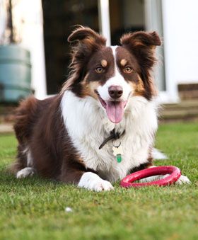
Disclaimer 1: the CSS properties we're about to use are new and browser support is limited - which explains the use of screenshots in this article. I'll try to hint at browser support by using relevant browser prefixes in my code examples but your best bet is to hit up When can I use?, HTML5 Please or similar for more details - or just refer to the captions in the demo,. If you want view the demo in all its canine glory, have both the latest Opera and the most recent WebKit build on hand - or try Google Canary.
Disclaimer 2: With the exception of object-fit, the properties below can be applied to any element. Object-fit can be applied to images, videos, objects, SVG content and input type="image".
Back to our photo of handsome Jake. To start with, we've dressed it up with a border, a bit of margin and a sliver of box-shadow. But there's a problem: imagine that our site's CSS specifies a size of 300 by 300 pixels for this image - no more, no less. Jake, despite his love of treats, is not a perfectly square dog and the aspect ratio forced on him by the dimensions of the image box would make the 280 x 339px picture look decidedly unflattering:
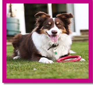
Screenshot 1 - Jake succumbs to an icky aspect ratio
Naturally we can tweak our CSS to accommodate the picture's actual dimensions, we can crop it in an image editor - or we can use the object-fit property to ensure the image's intrinsic dimensions slot nicely into 300 by 300 pixels:
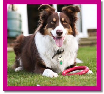
Screenshot 2 - Jake looking smarter with the help of object-fit: cover
img {
-o-object-fit: cover;
object-fit: cover;
}
Nice! Note that you're not restricted to simply covering the image box with the photo - you can also letterbox it or fill it to its exact dimensions using the "contain" or "fill" values. Need to adjust the position of the image within its boundaries? Object-position will allow you to do just that. Simply specify the positioning values just as you would for background-position.
Let's forget about sorting out aspect ratios for a moment - unfortunately object-fit's support is currently limited to Opera. What if our site's design called for every member of FreshEgg's executive team to be featured in classy black and white? Again, we could pre-process the image in a photo editor - putting it through the horrors of lossiness - or we could let CSS filters do the hard work.
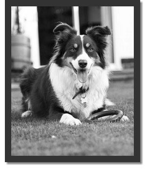
Screenshot 3 - In black and white with filter: grayscale(100%);
img {
-webkit-filter: grayscale(100%);
filter: grayscale(100%);
}
Note that because filters apply to any element, everything - your borders, outlines, box shadows - will be affected by application of an affect. Here are a few other filters you can enjoy:
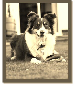
Screenshot 4 - Jake gets sepia'd! Like grayscale, this one's specified in percentages
img {
-webkit-filter: sepia(100%);
filter: sepia(100%);
}
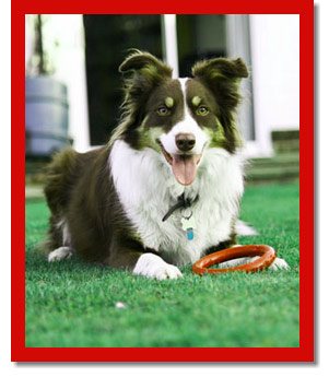
Screenshot 5 - Jake's brown bits are adjusted using filter: hue-rotate(degrees);
img {
-webkit-filter: hue-rotate(45deg);
filter: hue-rotate(45deg);
}
...As well as blur and contrast. Want to go nuts and combine filters? Nothing's stopping you.
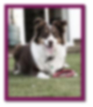
Screenshot 6 - Jake is blurred AND grayscaled at 50%
img {
-webkit-filter: blur(5px) grayscale(50%);
filter: blur(5px) grayscale(50%);
}
Fancy adding a dreamy fade effect to the bottom of Jake's portrait? Don't bother firing up photoshop. WebKit provides you with mask-image property to mask our picture using CSS gradients, raster images or even SVG.
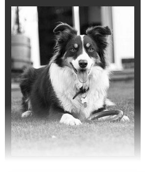
Screenshot 7 - Jake's picture with a masking gradient at the bottom
img {
-webkit-mask-image: -webkit-linear-gradient(rgba(255,255,255,1) 65%,rgba(0,0,0,0));
mask-image: linear-gradient(rgba(255,255,255,1) 65%,rgba(0,0,0,0));
}
Notice something? That's right, our box shadow has disappeared! Alas, a known bug of using mask-image seems to be the annihilation of box shadows. And finally, let's wrap it all up by adding a slight transform to our picture.
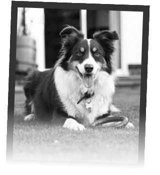
Screenshot 8 - Woof! Executive hound, 100% Photoshop free.
img {
-webkit-filter: grayscale(100%);
filter: grayscale(100%);
-webkit-mask-image: -webkit-linear-gradient(rgba(255,255,255,1) 65%,rgba(0,0,0,0));
mask-image: linear-gradient(rgba(255,255,255,1) 65%,rgba(0,0,0,0));
-webkit-transform: rotate(2deg);
transform: rotate(2deg);
}
Voila! Enjoy.