
The ultimate guide to mobile SEO
Understand why Mobile SEO needs to be a key part of your overall SEO strategy.


Depending on the type of website, you may find as much of 75% of traffic coming from mobile devices. For others, it may be the complete opposite. You need to be assessing information from your analytics package on a regular basis to see how your website is performing and the experience being offered to mobile users.
There’s no getting away from the fact that mobile has revolutionised the way we search and interact with brands. Since its introduction, the smartphone has become a gamechanger for search. It allows you to reach customers with hyper-contextual, personalised and relevant results based on implicit signals like the user’s location, current activity, and personal information.
With these signals in mind, our devices open a wider range of touchpoints, specific to mobile, for each step in the customer journey. These touchpoints are at your customers’ fingertips whenever and wherever they want, 24 hours a day and seven days a week.
Thanks to the smartphone, your brand has a constant connection with your audience, and that’s great – but is your business discoverable and useful when they need you the most?
To help you improve your mobile experience, we've put together the three pillars of mobile search, which extends far beyond the reach of the obligatory responsive website.
Pillar one: discoverable - The seven ways to make your brand discoverable on mobile
The first step in a successful mobile strategy is, of course, to make sure you can be found. No business likes to play hide and seek, especially on mobile, when your customers expect immediate, relevant and contextual results in their moments of need, whenever and wherever they want. Think about the different ways a customer might come into contact with your brand (touchpoints) on mobile, and ask yourself: ‘how visible is my business at each stage of their mobile journey?’
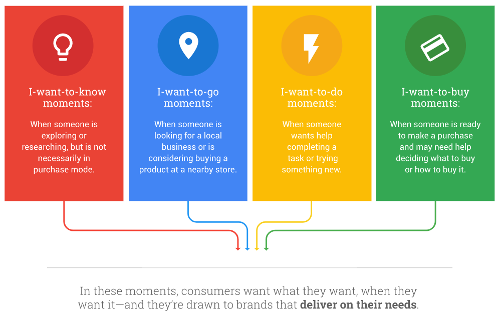
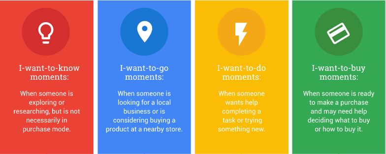
Are they looking to learn something, go somewhere, do something or buy something?
These ‘micro-moments’ are instinctive impulses where a person picks up their phone to complete a task. Understanding what your audience is looking for and which format they want to consume content is critical to making your brand discoverable on mobile search.
In pillar one, you'll find information on the following:
- Understanding and matching user intent
- Optimising your listings for local search
- Using Accelerated Mobile Pages (AMPs) to serve users quick and optimised content
- Make your app discoverable with App Indexing
- Video and rich results are dominating on mobile - so make sure you are using both
- Contextual voice search is the future
- Product inventory ads on Google Shopping
1. Understanding and matching user intent
Due to the unique functionality on our devices, search results are displayed differently on mobile than on desktop. On our mobiles, our interactions are more visual and gesture based. We swipe, scroll and tap through sites, apps and search results, and your content needs to reflect this.
It’s about brevity, and creating a seamless, interactive and frictionless experience. For mobile, instead of text-heavy long-form blogs, think lots of engaging carousel images, video content, short, snappy paragraphs and bullet point instructions.
If your audience is searching ‘how to fix a bike tyre’ (in their I want to ‘know’ micro-moment), they won’t want to read reams of text, and will likely prefer a video.

A quick Google search of this on mobile will show you the types of content that are ranking best, and potentially the type of content you should be creating.
2. Optimising your listings for local search
What is local search?
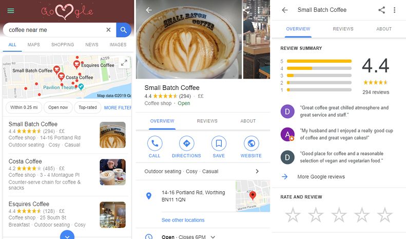
Local search is basically showing the user hyper-contextual information about a physical location, allowing them to easily navigate to a place, find contact information or view reviews. It’s specific to the location they’re in as well as the place they’re searching. The growth of ‘near me’ searches places greater importance on having fully updated and optimised Google MyBusiness (GMB) as well as other local listings to make your brand discoverable on local search.
Why is local search important?
Nearly a third of all mobile searches are related to location, and nearly two-thirds of smartphone users are more likely to purchase from companies whose mobile sites or apps customise information to their location, according to Think With Google
When a user searches ‘coffee near me’ with location services enabled, the results served are hyper-local to that place. The same search for ‘restaurants near me’ will present totally different results when done in Leeds compared to Brighton, for example.
The growth of local ‘near me’ searches in Google trends data over the last five years shows a key opportunity for brands to be useful here with hyper-targeted, relevant and localised content. Providing an optimal listing for mobile users across all of your assets will allow them to easily navigate to your store, call your local branch or see reviews of your business in their micro-moment of need.
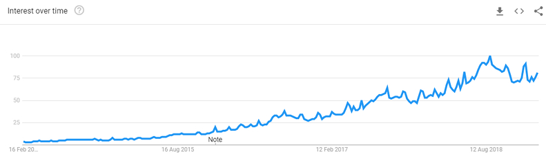
Google trends data for ‘near me’ searches
💡 Tips and considerations - become discoverable in local search:
- Optimise GMB listings. This is often the first exposure to your brand, and first impressions count. Download our guide to learn how to make your listing stand out.
- Consistently provide name, address and phone number (NAP) on all properties internal and external, including your website, GMB page, social profiles and external listings.
- Incentivise your customers to post positive Google reviews – this increases visibility and makes you stand out in local listings with star ratings.
- Provide photos, or go interactive and let users see inside.
- If you have multiple branches, provide pages for each store’s location on your site with as much contact information as possible.
3. Use Accelerated Mobile Pages (AMPs) to serve your customers quick and optimised content
What is AMP?
Lightweight, stripped back, high performing pages that load instantly for mobile users. It’s basically a smartphone’s dream. Accelerated Mobile Pages or AMP for short looks to make browsing the mobile web as fast and easy as possible. Delivering content literally in an instant – something that mobile users expect but do not always get.
Why is it important?
The more AMP becomes common in SERPs, the more expectations remain high for more of this type of content.
If a large percentage of your search share features AMP and you’re not yet doing so, you risk losing traffic to competitors who are already delivering a faster experience to users. If you want to reach (and delight) your audience at the discovery stages of their journey, it’s crucial to provide them with this positive and seamless first impression.
💡 Tips and considerations - find out more about AMP and how you can get started.
4. Make your app discoverable in search results with App Indexing
What is it?
Another way for your brand to be discoverable on mobile is via your app. Google’s App Indexing allows search engines to crawl and index content within your app, so it can then be surfaced within search results for relevant queries. If they haven’t already downloaded, users will then be able to install your app directly from the search results.
An example of a company which does this really well is Airbnb. If you search the brand from your mobile you’ll likely be served listings directly from the app instead of the mobile site, providing a quicker and more interactive experience. You could also take this one step further with deep linking - a process of sending users to relevant screens within the app via a specific URL, these can be used on a campaign basis via email, social, SMS etc.
Why is it important?
Deep linking and app indexing enable users to be sent directly to apps at relevant points in the journey, allowing them to complete tasks in an environment specifically designed for smartphones.
It’s useful for re-engaging users or prompting users to go straight to your app via auto-complete suggestions. It opens another touchpoint for a mobile user to discover your brand, allowing you to tap into a new audience via Google search that you previously wouldn’t have been able to.
💡 Tips and considerations - Make your app discoverable in search results with App Indexing.
- If an app features in part of your digital arsenal, app indexing and deep linking is an absolute must for your mobile strategy. Consider what points in your user’s journey they would prefer to visit your app, bearing in mind an app’s ability to be personalised, faster and offer better UX than a website.
5. Video and rich results are dominating on mobile – so make sure you’re using both
What are rich results?
Rich search results are specifically designed for mobile users, answering their need in a format suited to their intent. They can swipe through recipes, easily navigate holiday destinations, filter results further, and click straight through to the exact point in a video.

Why are they important?
Google’s priority is to provide a truly mobile first experience; so rich cards are a perfect example of this. Allowing mobile users to interact with content in a much more mobile friendly and intuitive way, directly within search results.
Video typically meets the ‘I want to know’ micro-moment more effectively than text. Google recognises this, and video carousel results are ever-more present within mobile search results.

Many search queries are also answered directly within mobile search results in the form of answer boxes. These rich answers often take up valuable real estate and on something as small as a mobile phone screen can be critical in grabbing the attention of a mobile user. Answering these questions directly within the search results again removes an additional step for the user.
Tips and considerations – how to make your brand discoverable with video and rich results
- You should always be answering a user’s need in their preferred format. Consider what questions your users ask about your product and service and how do they expect to digest this.
- A content strategy will help you understand your audience’s intent, evaluate whether your content is meeting their needs, and create a roadmap that does exactly that.
- To learn how to feature your content in rich card format for more stand-out, interactive mobile search results, read our blog on how to use Google Tag Manager to inject structured data into your site.
6. Contextual voice search is the future… ‘OK Google, what movies can I see tonight?
What is it?
Voice search has been around for a while but the difference is, now our devices understand context and nuances of conversation. With the rise of artificial intelligence and the popularisation of virtual assistants from Google and Amazon, more users are turning to this new tech to easily complete tasks and provide immediate answers to questions.
The best example of this came at Google I/O 2018, with the Google Assistant making phone calls on behalf of users:
Why is it important?
Voice search will continue to shape the way users interact with their devices. It reduces further remove additional steps in their journey to get immediate answers. Google and other tech giants are working hard to turn voice search into something more than just a mobile search tool, with a goal to use it to create the ultimate mobile assistant.
💡Tips and considerations - voice search is the future
- With voice search queries taking a more conversational and longtail form – i.e. ‘show me the local news?’ instead of typing ‘Worthing news’ into the computer – marking up your content with structured data is key to explicitly inform search engines what it is.
- Google is putting a lot of resource into understanding and processing natural language to provide a more natural and frictionless user experience.
- This can be useful where search engines might have difficulty differentiating between terms, i.e. jaguar the animal vs. the car manufacturer.
- For more on artificial intelligence and how to maximise its potential for your business, read our blog.
7. Product inventory ads on Google Shopping
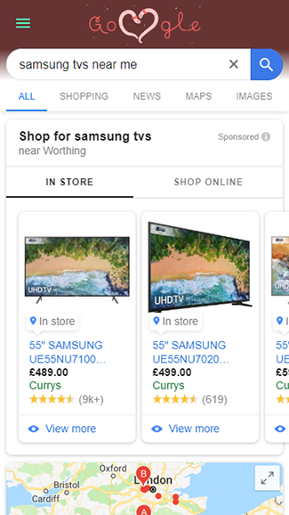
What are product inventory ads?
This is a great Google Shopping feature that notifies mobile users of the in-store availability of products searched. It’s great for answering the ‘I want to buy’ micro-moment with specific, localised and relevant information.
Why is it important?
Mobile users are driven by convenience; product inventory ads can be made to play to this. Showing a user their desired item is in stock and only 1.7 miles away will draw their attention and make it nice and easy for them to move from research and consideration to the purchase phase of the customer journey.
Once driven to your physical location, users will still use their smartphones for research in-store. Comparing prices, products, or looking for reviews. Are you discoverable when a user is doing this?
💡 Tips and considerations - Should you be doing it?
- This could be taken as a threat, with a fear customers will go elsewhere. However, brands like Sephora can be seen turning this into a strength. Encouraging users to scan the physical item with their smartphone to view further product information, keeping them engaged with the brand.
- Asking users what they were researching on their smartphones in-store will also be valuable, search for this information and see if you are discoverable. Offers for those in-store could also be effective because a user will probably not go to another store for a cheaper item if you give them an offer on-the-spot.
Pillar two: useful and convenient - Let’s learn how to make your brand useful on mobile
The culture of mobile is driven by three things: immediacy, relevance and speed. If your brand is to succeed on mobile, your content and onsite experience needs to balance all three.
According to Ofcom’s 2018 report 78% of all UK adults own a smartphone, and 62% of time spent on the internet is on mobile. As far as your users are concerned, it’s no longer acceptable to allow slow loading times or non-useful content formats block their journey. Patience is not a value held by today’s connected population.
Users have whatever information they need on demand 24/7, in the palm of their hand. This age of immediacy has created a culture of impatience, which means immediacy, relevance and speed has never been more important.
If you want your customers to progress along their journey to purchase – you have to be useful right away, with simple, beautifully optimised content that’s catered specifically to mobile, reducing steps for a customer to achieve their goals.
On mobile, less is more – and how do you get it right?
1. Answer your mobile user’s needs.
What does this mean?
Put simply, your content must answer the questions the user is asking at that moment. If they’re out on the bike and have a snapped chain, do they want a long list of instructions on how to fix it, or a short video clip showing them the physical steps?
This principal doesn’t just apply to mobile search, but user needs differ depending on the device they’re using, so it’s key to take this into account and answer those needs accordingly.
Why is it important?
Answering mobile user needs in the correct format is a must. Remember, if you don’t a competitor will.
Providing answers in a useful format means your customers will develop an affinity to your brand, and build trust, authority, and understanding between the two of you. We’ve all got our favourite apps, most-read websites, our go-to source for learning – we choose these because these brands understand and cater exactly to our needs.
In short – they make it easy for us to consume their content and continue along the customer journey. No road blocks allowed.
What are your next steps?
Take a step back to consider your audience’s needs as a mobile user. Think about what your audience want, need and should know about your product/service, and then take this further and consider how the smartphone changes these needs.
Put yourself in your customer’s shoes and attempt to answer these needs yourself, this will help you identify where the gaps or pain points are. Always answer your brand’s key micro-moments in a format users expect.
Conducting customer experience discovery will give you a strong understanding of what it is your audience is trying to do, what they’re looking for, and what their expectations are.
2. Provide a strong user experience for mobile:
What does this mean?
On mobile, it’s got to be simple. No one likes to pinch or zoom their way around an unoptimised website, or wrestle a long, complicated form when on the go.
The key is to be frictionless. You’ve got to make it easy, allowing users to access the content they want to complete tasks with as no hassle. It’s removing unnecessary steps that could act as barriers to conversion – instead of that pesky complicated sign-up form, use social logins for one-click actions, for example.
Your mobile experience should be intuitive, fast, and pain-free, fully considering the limitations and advanced features that a smartphone provides.
Why is it important?
A poor mobile user experience (UX) will only frustrate users and result in them abandoning your site due to irritation. The risk goes beyond losing just that particular conversion, but future ones too, as they may not come back to your site at all due to their poor experience.
Ultimately this can damage your audience’s opinion of your brand and reduce the trust they have in you. An elephant never forgets!
What are your next steps?
Think about the actions a user must be able to complete on a smartphone. It’s easy to get caught in a trap of squashing everything on your desktop into a mobile view but in our experience, that’s never a good plan.
Often less is always more in this respect. Ask yourself, what tasks does your customer really want/need to complete, and what else is a distraction to this?
Aim for simplicity, clarity and speed. Think about what a mobile user is really on that page to do and don’t distract from it. Consider how the features of a smartphone help them complete their task, such as GPS, camera, simple userface, etc.
Fancy a bit of extra reading? Check out our Five Considerations for Mobile User Experience.
Something as simple as a click to call button can make all the difference as a small yet helpful addition that smooths a mobile user journey. Consider, what a smartphone is cable of that a desktop isn’t and how this can benefit your mobile users.
3. Make sure your content is easily digestible on mobile
What is it?
This one’s easy - literally. You should provide content in a format that’s quick and easy to digest on mobile, showing mobile users what they expect to see immediately upon page load – instantly answering their intent.
Give users a choice to consume content in the way that they want. Whether that’s enabling them to download a podcast audio version of your long-form content for easy consumption on the go, or providing a quick TLDR (too long, didn’t read) summary at the top of your posts so they can skim.
Make it easy, always with mobile in mind.
Why is it important?
Mobile users don’t often have the time or patience to digest a full piece of content. They tend to skim read or scan articles and content for key takeaways in as little time as possible.
Cater for this by breaking content down into bite-sized chunks, using bullet points, and summarising key information at the top of an article.
What are your next steps?
Think about what your mobile users might be doing when consuming your content. Are they on the go and pushed for time? Does your content answer their questions quickly and can they take-away key information almost immediately?
What pieces of content can you break down into bite-sized chunks? Many publishers use a ‘too long didn’t read’ (TLDR) format which proves effective. This gives the user the choice of scrolling to further read the article if they want to.
Try only showing the key information first, think what that user has to see upon page load, and don’t overwhelm them. Accordions and tabs can be used to hide content until a user needs it, give the user control, and let them decide when they are ready to view secondary content.
4. Be quick…mobile users want their information instantly, how quickly can you deliver?
What is it?
Not much to say about this one, it’s pretty self-explanatory – delivering a fast loading experience to your users, allowing them to access content, buy and convert as quickly and efficiently as possible.
Why is it important?
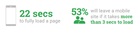
Site speed is essential to being useful and driving conversions. Mobile users want to know, go, and buy quickly. A fast and frictionless mobile experience will drive engagement and ultimately increase conversion.
Users will bounce if a site takes too long to load. Not only that, but they’ll also convert less and be less likely to buy your products or services again.
What are your next steps?
Simple - make sure your site loads quickly. The importance of a fast experience for mobile users cannot be argued. Providing a quick mobile experience can be as simple as ensuring you serve scaled images for mobile, load page elements in a suitable order or using a content delivery network.
For more information on page speed see our blog post, quick wins for optimising your mobile site.
5. Provide a frictionless path to conversion
What is it?
This is all about making sure the key moments where a user will convert on your site are as seamless as possible on a mobile device, such as going through the checkout process or signing up to a newsletter.
Why is it important?
With mobile usage overtaking that of desktop in 2016 ensuring the growing number of smartphone internet users can convert just as easily as desktop users is undeniably important.
Not allowing users to easily convert on mobile will have a negative impact on mobile conversion rates, damage trust in your brand, and ultimately impact your bottom line.
What are your next steps?
How easy do you make it for your users to convert on mobile? Think about the true necessity of each step. If a user’s main goal is to fill out a form, ask yourself, is all of that information required right now, or can some of this information be collected at a later stage of the journey? Long, complicated forms on mobile are the bugbear of many users. Remove as many steps as possible to let a user complete their goal.
Bear in mind that mobile users may be pressed for time or on bad connections. Make it easy for them to purchase on a smartphone - cut unnecessary additional steps to make purchasing seamless throughout the whole journey across all touchpoints.
Give smartphone users a choice and a clear route to purchase at the right points, maybe pushing users to your store is more effective than purchasing online? Or perhaps someone interacting with your social posts is ready to purchase, but think about whether you send them to the right destination.
It’s ultimately about understanding which stage of the customer journey a user is at and adapting the experience to suit – with as few bumps in the road as possible!
Pillar three: measurement - Four steps to measuring and refining success on mobile
With 62% of all internet browsing now happening on mobile, tracking mobile performance of your site is critical and should be given as much attention – if not more – than tracking your site engagement on any other device.
Think about creating mobile-specific dashboards in Google to understand how mobile users are interacting with your site and identify sticking points to conversion.
Ask yourself, is certain content more popular for mobile users, and is this content accessible and easy to navigate on a mobile device? Monitor how engagement improves when you start specifically answering mobile user needs or make mobile user experience (UX) improvements.
1. Identify the queries you’re currently visible/discoverable for on mobile
What does this mean?
This is about understanding what your customers are looking for on mobile when they come to your site – does the content on your site match what they expect to find? Use search monitoring tools to identify the types of queries they’re using and identify how you’re already discoverable on mobile devices.
You can use tools such as Google Search Console, SEMrush and our bespoke visibility reporting tool to find where you currently have strong mobile visibility and will help you spot opportunities for improving your mobile search performance.
Why is it important?
You can’t grow what you don’t know! Without an understanding of your current strengths and weaknesses with mobile visibility, it’s impossible to know where to start to improve.
Knowing the types of mobile queries you’re appearing for in search for will start to reveal your audience’s ‘micro-moments’. A micro-moment is a moment of reflex. It occurs when a user instinctively turns to their device to act on a need – to learn something, do something; to watch or to buy.
Side note: learn more about micro-moments and why they matter for SEO on our blog.
Once you understand these moments of need (i.e. the mobile user’s search intent), you can test your site to see if you’re both discoverable and useful (providing relevant content and a good user experience) for these search queries. For example, if a user has come to your site after searching for ‘coffee shop workspace in Brighton’, does your content provide the information they need about workspace facilities, the coffee menu, pricing, and opening times? Is the experience optimised for mobile devices, e.g. is click-to-call enabled so they can easily phone you, and can they navigate to your premises from where they are?
It’s important to look at mobile queries separately to desktop, as context differs massively by device. In doing so, you may discover needs that are important to your audience that your site doesn't currently meet.
What are your next steps?
Use tools such as Google Search Console to track and identify mobile-specific queries. Search for these queries on a mobile device for yourself and see whether you are discoverable and if your result and destination for this intent is useful for a smartphone user.
Compare mobile search queries to desktop queries, is the intent different due to the mobile user’s location, and are different results presented on mobile devices compared to desktop?
2. Constantly monitor how users interact with your mobile pages
What does this mean?
This is the process of reviewing real mobile user interaction with your website. Tools such as Yandex Metrica and HotJar allow you to see what your users truly do on your mobile site, using heatmaps, user recordings, analysis of forms, conversion funnels and more.
They also show what the user tries to do but can’t, and why this is – e.g. because of a usability roadblock such as a complicated form, slow site speed, unclear navigation – so you can improve your mobile user experience.
Why is it important?
User recordings are important for understanding if mobile visitors are truly engaging with your content or if it doesn’t meet their needs and they bounce. Using tools like the ones mentioned above, you can view exactly what users are doing on your site, what they cannot do and what pieces of content they care about, so you can create and do more of what works.
Screen recordings provide evidence from real users on what the sticking points on your website are during their journey to convert. This allows you to quickly come up with a solution, essentially solving issues on the fly. It’s real-time optimisation at its best.
Heatmaps are critical in seeing if users are truly engaging with your content, or if they only view a small portion of the page before moving on. You can also identify if there are parts of your page a large percentage of users try to tap expecting to be taken to a new page.
You can use this insight to change the above-the-fold content, set up new landing pages, improve navigation, and monitor the impact on the ongoing mobile UX of your site via Google Analytics dashboards and real user recordings.
What are your next steps?
Set up tracking for tools such as HotJar and Yandex Metrica.
Contact us if you need help with this and our team of web wizards will get to it.
Review some recordings of mobile users interacting with your site and start identifying sticking points. Are there certain pages with unusually high drop-off rates and are these pages that would be considered important to conversion?
Try segmenting session recordings by which parts of the site user visits – is the checkout process a real issue, for example?
3. Make sure all digital assets available to mobile users are tracked
What does this mean?
With so many mobile touchpoints for customers to interact with your brand, it's important not to let any fall through the net when reporting mobile performance. Bring everything together to get a full picture of a user’s journey across all devices. This will also allow you to see where each mobile asset and experience sits within the customer journey .
Set up correct tracking of all of your mobile assets:
- AMP
- Apps
- Deeplinks & app search
- Local search
- App stores
- Promotion/campaigns for apps
Why is it important?
In this mobile-first age, the user journey is far from linear. A user might first discover your content on a tablet, research further on their desktop, return to their mobile to buy (if you’ve nailed your mobile UX), and re-engage via their smart watch.
Attribution of conversions to individual devices is becoming obsolete. Instead marketers need to consider where the smartphone fits in the entire customer journey and how it contributes directly to your bottom line across all channels.
What are your next steps?
Be aware of all owned mobile assets and the tracking implications for each.
Mobile is a piece of the puzzle that shouldn’t be treated in isolation, its impact and role needs to be accounted for by viewing the bigger picture. Making sure you’re tracking all assets will give you this bird's-eye view.
Have you considered?
- Joining up on- and off-line tracking to monitor how many in-store conversions were influenced by mobile
- What a user researched before making their purchase on mobile?
- How mobile device usage changes per channel?
- When and where users are transitioning to your app from the web?
4. Create simple dashboards to review mobile performance
What is it?
Reporting dashboards that specifically report on mobile performance, allowing you to truly monitor how you perform on just mobile devices instead of treating mobile as an afterthought or addition to overall reporting.
Sidenote: Read our blog about how Google’s new cross-device tracking can show you where your onsite conversions are really coming from
Why is it important?
The significant rise of mobile usage (62% of all internet use in the UK, according to the latest Ofcom report) justifies the need for smartphone usage to be tracked, analysed, and reported on as its own entity.
Mobile-specific behaviours will influence all metrics such as bounce rate, time on site, conversions and more, differently than desktop and tablet – with site speed being one of the most important, especially since the rollout of Google’s Mobile First index .
There are lots of tools with simple dashboards to help you analyse mobile performance, such as Google Data Studio which is perfect for creating customisable, easy to understand visual reports.
What are your next steps?
Create your own reporting dashboards that report specifically on mobile performance, being conscious not to totally isolate mobile from other analysis – mobile is a huge part of the whole journey.
Use these reports to monitor changes specifically designed to benefit a mobile user, this can then be tied back and accounted for in performance improvements of the whole site.
A recap on the three pillars of successful mobile search strategy:
To conclude this mobile SEO series, we have covered the importance of being discoverable, making your content useful, and measuring and making refinements to your mobile search strategy.
As you can see, a lot of work goes into making a successful mobile SEO strategy – it’s so much more than simply creating a responsive website.
- Be Discoverable – make sure you can be found online when your audience are actively searching for you.
- Be Useful – make it easy for your users to engage with you by directly meeting their needs with useful, relevant and carefully crafted content and UX that’s optimised for mobile.
- Be Measurable – set yourself up for success by understanding how to monitor and track all mobile assets and on-site engagement.
Further reading
Do you have a challenge we can help with?
Let's have a chat about it! Call us on 01903 337 580