Data visualisation best practice for presentations and beyond

Data is most useful when people can act on what they learn from it. Often, presentations can be overwhelming due to the amount of data, lack a clear storyline and direction, and not be properly aimed at the audience. This can lead to people coming away from your presentation having misinterpreted or misunderstood the data and needing clarification on what they were supposed to take away and do about it. This is why data visualisation is so important. Effectively communicating with data is an invaluable skill, so in this blog post, I will provide my four top tips for improving data visualisation.

Data is most useful when people can act on what they learn from it. Often, presentations can be overwhelming due to the amount of data, lack a clear storyline and direction, and not be properly aimed at the audience. This can lead to people coming away from your presentation having misinterpreted or misunderstood the data and needing clarification on what they were supposed to take away and do about it. This is why data visualisation is so important. Effectively communicating with data is an invaluable skill, so in this blog post, I will provide my four top tips for improving data visualisation, which are:

  1. Embrace Simplicity
  2. Harness the Power of Colour
  3. Know Your Audience
  4. Tell a Story

#1 Embrace Simplicity


If your slides contain too much information, your audience will not know where to look and will spend far too much time trying to figure out what they're supposed to be taking away.

Our goal is to make it as easy as possible for anyone who looks at your slide to immediately understand what you're saying. To do this, keep your slides as simple as possible.

Headshot of Lola Watkins

Try to limit yourself to one idea per slide, and don't fill them with too much writing or too many charts—you can work through your points with each chart one slide at a time.


Lola Watkins, Trainee Web Analyst 

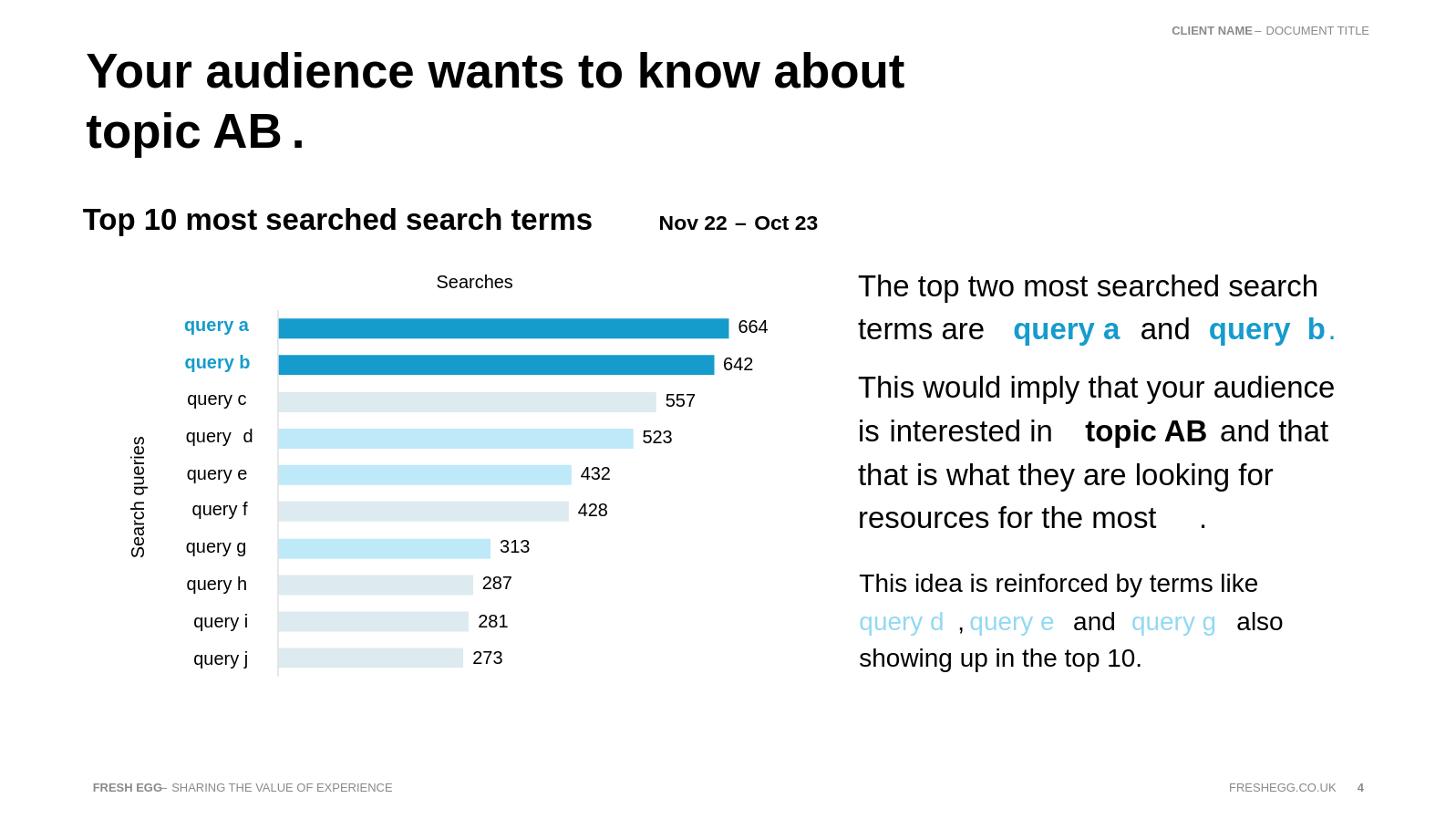
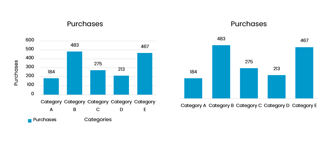
You want your charts to be simple as well. Removing visual clutter makes the data easier to see and digest. See what elements you can remove from your chart without removing any information. If two elements tell you the same thing, like data labels and the y-axis, you don't need to include both.

Looking at the example below, you can see we have removed the y-axis, the axis titles, the legend and the reference lines. The graph on the right is now much cleaner and easier to read, and with all those elements removed, we haven't lost any information.

Data visualisation

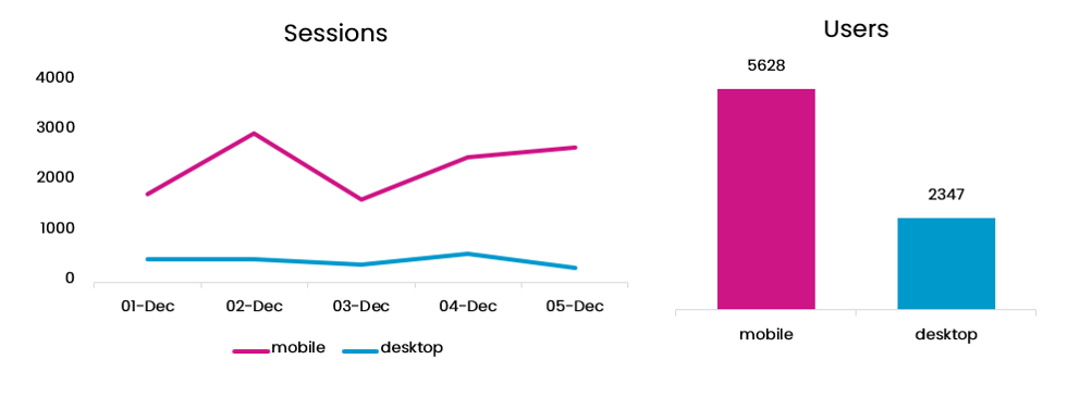
Next, let's look at an example of an incredibly busy slide. There is nothing here to signify what is even necessary to look at. Your eyes will dart all over, looking at the different charts and trying to read all the words. Your audience will be far too preoccupied with deciphering what's happening in your slide to listen to what you have to say.

Busy slide

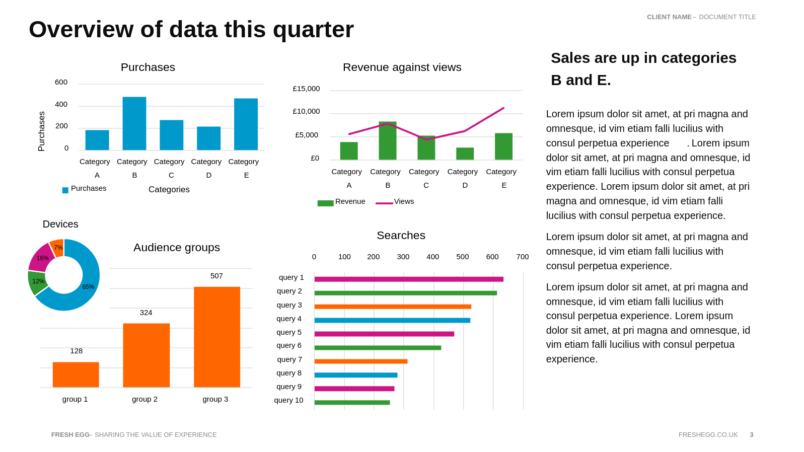
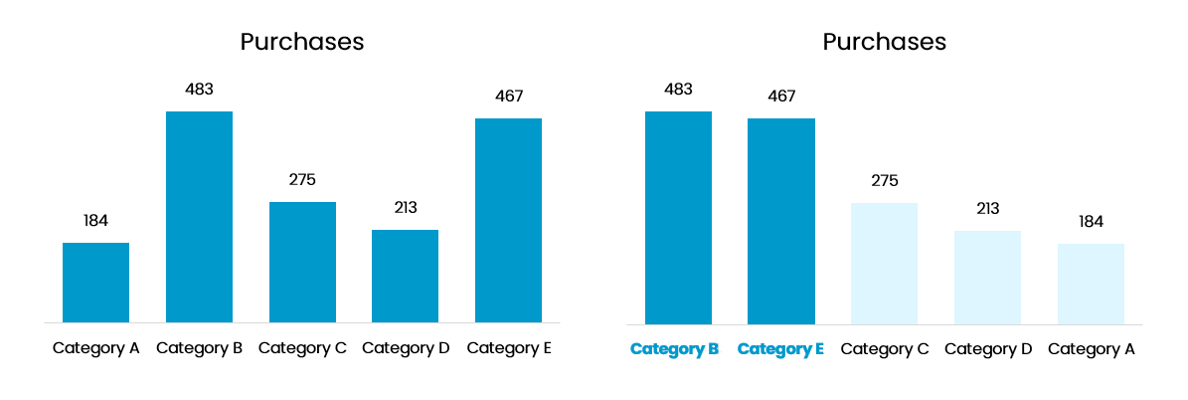
So, let's simplify it! Here's what I recommend.

Take it one chart at a time and make the slide about what it shows us. Limit yourself only to include the necessary information. We need to know what this chart is, what it shows us, and what it means. Steps we have taken to improve our slide in this regard are reducing the copy, calling out the critical insight in our title and utilising colour to link what we've written to the graph and guide our audience's attention.

Less is more in data visualisation

Do you have an analytics challenge we can help you with?

#2 Harness the Power of Colour


When used strategically, colour is a great tool to help you communicate your ideas. You can create visual contrast with a pop of bright colour to immediately draw the eye to what you want people to look at. When choosing colours, you want to be conscious of the different meanings of colours (for example, red=bad, green=good) and how that may not always be the same between different cultures. See our blog, The impact of colour in your designs.

Another thing to remember when using colour to communicate findings is colour blindness. There are online accessibility checkers that you can use to see how accessible your presentation is for different types of colour blindness. You can always ask if anyone in your audience is colour-blind so you can make sure it is accessible for them.

Harness the power of colour

You can use colour to help your audience easily distinguish between different categories, but make sure these colours stay consistent throughout your presentation so your audience will easily recognise each category.

Let's take that chart we simplified in the first example and make it even better using colour. Immediately, in the second chart, your eyes are drawn to categories B and E, and you know straight away that these are the categories with the most purchases and that that is what we will be talking about.

We also changed the order of the bars by sorting them by the purchases in descending order, adding clarity to the chart.

Harnessing the power of colour in data visualisation

#3 Know Your Audience


When creating something you intend to present to other people, it is important to keep in mind who these people are. Ideally, you want your audience to be engaged and to come away having learned something, with the intention of acting on the insights you gave them.

To do this, you need to communicate in a manner that is easy for them to understand. Think about the language your audience is familiar with. Don't use lots of technical jargon if there will be people in your audience who won't understand it, and in cases where specific terminology is needed, make sure to explain what the terms mean.

Another essential part of keeping your audience interested and paying attention is to make sure you are talking about something that matters to them. Speaking to your audience beforehand and asking them questions about what they want to know from the data is a good idea. You could, as Lea Pica recommends in her book Present Beyond Measure, tell them to imagine they're sitting down for a coffee and catching up with the data like it's a person; this can help less technically savvy people to tell you better the information they are interested in.

For example, if your audience consists mainly of technical marketers, they will want to see campaign performance details segmented by device, audience, sales region, and product category. They will probably want to know every detail and won't be afraid of common abbreviations like CVR, PPC, and AOV. They will expect to see them.

However, if your audience is higher management, they are more likely to be interested only in the top-level figures and won't be particularly interested in the details of the 'why'. If you want their full attention, show them how the change you highlighted translates into monetary gains or losses, as that is the language they speak.

#4 Tell a Story


The best way to keep your audience engaged and understand your presentation's key messages is to have a consistent storyline they can follow

  • Understand the overall idea: To ensure your presentation stays on topic, you need to clearly understand the overall idea you want to communicate to your audience and what you want them to do with that information.
  • Single sentence works: One good way to do this is to create a throughline, a single sentence that can summarise your presentation. It should tell you what it is about and hint at what you found and what you want your audience to do about it. Another tip for crafting your storyline is to use the narrative structure of a typical story with a beginning, middle and end.
  • Set the scene: In the beginning, you should explain what your presentation is about and why. Then, you can build tension by covering your expectations and hinting at what you found. The climax of your story is when you reveal your biggest insight or most important takeaway. After that, the resolution is where you recommend what they should do with this information, explaining what the results of that will be and why this will be beneficial.

Data visualisation and narrative

If you want to read more about crafting a narrative arch for your data, check out this great blog post about the art of narrative data visualisation.

If you want to learn more about effective data visualisation in Looker Studio, I recommend Ahmad Kanani's Looker Studio Masterclass and follow Ralph Spandl on LinkedIn.