
53 A/B test ideas discovered in two weeks for Simplyhealth
Our expert UX review provided Simplyhealth with test hypotheses, insights and direct actions to improve usability and drive performance.


Client: Simplyhealth
Sector: Financial Services/Insurance
Website: Simplyhealth.co.uk
Services: CRO, Analytics & Data, User and audience research, Experience design, In-housing
Key project outcomes
53
test hypotheses in a prioritised backlog
80+
insights from an expert UX review
45
dev actions ready to implement
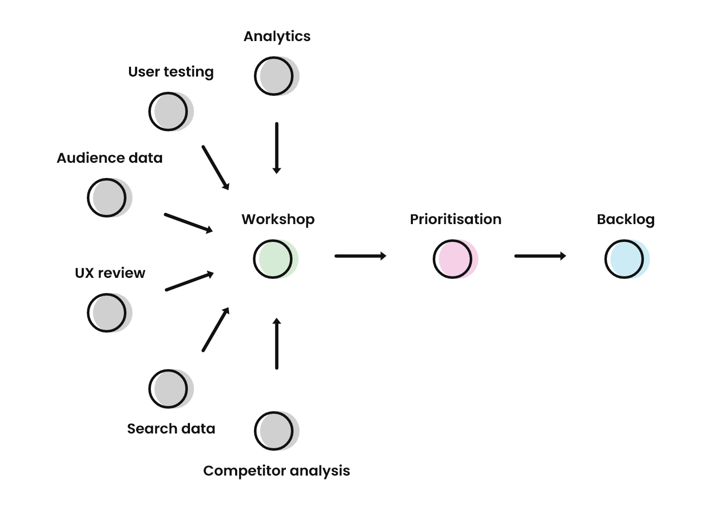
We used analytics, audience research, search engine data, and user testing to produce a full backlog of A/B testing ideas. Within two weeks, Simplyhealth were ready to implement an evidence-based testing roadmap.
The challenge
Simplyhealth is one of the UK’s most popular health providers, with over two million active members and 8,000 corporate clients. Regardless of previous health, members pay a standard monthly fee to access 24/7 GP appointments, claim money back on common medical costs (including glasses) and receive hundreds of exclusive discounts.
Having introduced a new “1-2-3 Health Plan” in 2022, Simplyhealth needed support establishing an optimisation roadmap for the sign-up process. At the same time, their CRO team wanted to collaborate on a selection of high-quality test concepts for their health and dental plan product pages. We aimed to generate and prioritise a rich backlog of a/b testing ideas and identify a list of direct-to-developer actions.
"(Fresh Egg) walked us through a step-by-step discovery process that included user testing and insights from our website analytics. The workspace they built made everything transparent, so it was easy to exchange ideas and collaborate. By the end of the session, we had reviewed a mountain of data, annotated the sign-up journey with hundreds of observations, and grouped them insights into promising themes. Within days, that workspace had been turned into a prioritised backlog of test concepts."


John Crossland, Head of Growth, Simplyhealth

Our solution
Research and discovery
We demonstrated a transparent, collaborative process that Simplyhealth will apply to future optimisation projects.
To facilitate this, we used full-page screenshots to build a map of the Simplyhealth website and create a shared workspace. Each page was annotated with observations from six different research methods, making visualising the insights and analysing the journey in detail easier.
Our ideation process culminated with a collaborative Discover Workshop, during which members of the Simplyhealth team contributed their own insights and ideas.
"This project demonstrated how important it is to combine different data types when analysing a user journey. We identified clear behaviour patterns from the website analytics and enriched these observations with insights from user testing and our own UX analysis. Presenting the whole picture back to the Simplyhealth team was an absolute pleasure, and it formed the basis for a productive ideation workshop."

Stephen Courtey, Associate Director of CRO
We will drive increased revenue
The outcomes
Encouraging new sign-ups
Before our discovery work, only 4% of new visitors to the Simplyhealth website continued to the sign-up process. Audience research suggested that, rather than a lack of interest, this was due to ambiguity about how the health plan works and a lack of clarity about the next steps.
Our UX review produced 12 A/B testing ideas based on the clarity of the plans, including suggestions for new content and alternative images. Alongside this, we produced 11 A/B test concepts to improve the sign-up module's usability and prominence.
Reduced friction in the sign-up process
Users gave positive feedback on the 10-step sign-up process, but two steps caused many more exits than the others. When users were first exposed to the concept of a 12-month contract, the exit rate rose to 57%. By comparing this page progression data with audience and user research, we identified missing detail and common objections that could be addressed with updated content.
Our discovery produced 11 A/B testing ideas based on managing common objections, clarifying areas of confusion and highlighting the benefits of plan membership. We also identified 16 test concepts for making the sign-up process more user-friendly.
Encouraging product cross-pollination
Whilst member feedback for Simplyhealth cover is overwhelmingly positive, the analytics show that few members subscribe to both health and dental plans. In the long term, this trend may prompt the creation of combined cover, but in the short term we aimed to increase the visibility and awareness both products.
Our Discovery highlighted opportunities for using personalistion to adjust the product mix users are exposed to on return visits. We also made recommendations for introducing cross-product promotional content to visitors who successfully sign-up for a health or dental plan.
Loading
Talk to us about optimising your website
We can help
Do you have a challenge we can help with?
Let's have a chat about it! Call us on 01903 337 580